


.svg)


.png)
When it comes to creating user interfaces (UIs), user experience designers can get too close to the project and lose sight of basic usability. Sometimes you have to take a step back and obscure your view just enough to see potential problems that you might not notice otherwise. Here are some simple things you can do for a quick usability check. These tips are so easy, you'll find yourself doing them all the time.
1. Shrink it: Make your design so small that you can't read it. The easiest thing is to stand several feet from your display. Stand across the room from your computer. Zoom out to 25% scale. View the design on a small screen device. All these techniques can help you step back to see what stands out and what doesn't. Changing scale will give you enough of a fresh, new perspective to see what “pops” -- almost as if you’re seeing the design for the first time.
2. Distort it:You can do this just by blurring your vision, but if you don't like flexing your eye muscles: apply a gaussian blur or use a pixelate filter, like a Color Halftone, Pointilize, or Mosaic. Making the design blocky with pixelation forces you to see your design differently. A blur test will help you notice which areas draw your attention and why (e.g., color, contrast, size, shape, etc.).

3. Change the language: Have you ever navigated a website in an unfamiliar language? Good user experience (UX) can help you get around without reading a single word. Change the font to something non-native, copy and paste the language from a non-English website, or use lorem ipsum dummy text. (My favorite lorem ipsum generator is Bacon Ipsum). Being unable to read it allows you to focus more on the overall user experience without being distracted by words. Changing the language removes words as a tool and forces you to see if the design can stand on the strength of other elements (e.g., position, proximity, alignment, scale, color, etc.)
Subtle Isn't Obvious
When you start checking designs using these techniques, the first thing to go is usually subtlety. It might be considered the hallmark of sophisticated design, but it's often lost on the average user.
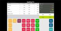
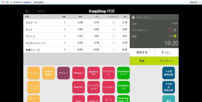
In the example below, the navigation's active element is much less obvious when obscured. We might want to think about how we can add better visual cues.
While we use these techniques frequently to check our designs, they are also great for user testing. Try one of these techniques with a user and see if you get better feedback. It can remove some of the noise that you often receive about content-related confusion and help maximize useful feedback.
These ideas force you to see a design differently and can help you quickly spot where you might need to beef up the user interface. Sometimes the best way to really focus on an interface is to blur it.
Bonus Content: If you're reviewing code (vs. a design), use The Designer's Checklist for Reviewing Pull Requests.
Need help with user experience or user interface design? Our team can help you design great user experiences. Read more here or contact us today.
Previous Post

Next Post