


.svg)


This is part one in a multi-part series on usability issues with fast food eCommerce websites. We visited fast food restaurants to test how real-life users experience ordering through their websites.
In each part, we'll highlight the usability problems (and possibly some successes) we discovered while performing guerrilla user testing(1) at popular fast food restaurant locations.
We'll also offer suggestions on improving each website for higher conversions and customer satisfaction.
Why Study Restaurant eCommerce?
Restaurant eCommerce ordering is worth studying for a variety of reasons:
-
Restaurants have some of the highest conversion rates in the industry(2), making them easier to study because their user base is very motivated to complete a transaction.
-
Restaurants have complex menus with many options, bundling, and pricing configurations.
-
Restaurants require users to select a store location and often choose between pickup or delivery options, which adds steps and complexity to the checkout flow.
-
There are a tremendous amount of different restaurants and design solutions to compare.
With this series, you will learn from fast food’s successes and failures. Let's get started!

Case Study: Wendy’s

For part one of our series, we studied users ordering at http://wendys.com. By testing and evaluating how users navigate the site, we will discuss some of the biggest problems and suggest how each issue could be solved.
Usability Issue: Unclear Call To Action
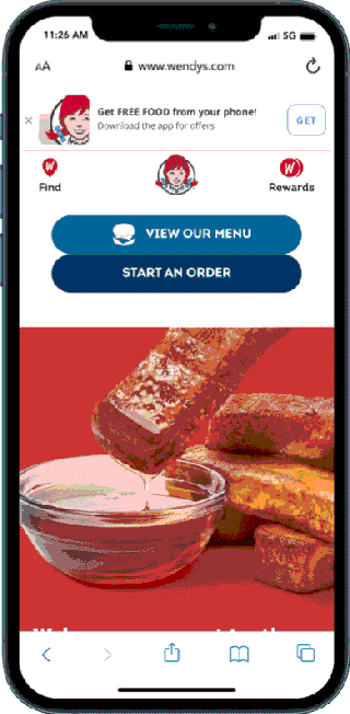
The first usability issue is unclear call-to-action buttons on Wendy's home page. The CTA buttons are placed close together, making it easy to pick the wrong one, slowing users down, and preventing them from completing their transactions.
.png?width=320&height=641&name=Untitled%20design%20(3).png)
Highlighted in yellow are the two call-to-action buttons on Wendy's home page that appear visually the same. The two CTA buttons are so similar that they confuse the users as to which button is the quickest path to order. The CTA buttons' proximity and similar visual style slow order progress and lower conversion rates.
Solution: Better Placement
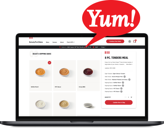
KFC's site shows a better competitive example of how to solve the issue. The CTA button is better placed on the home page. Following UX best practices(3), KFC has designed a CTA button that is reachable by thumbs and presents a clear sales path.
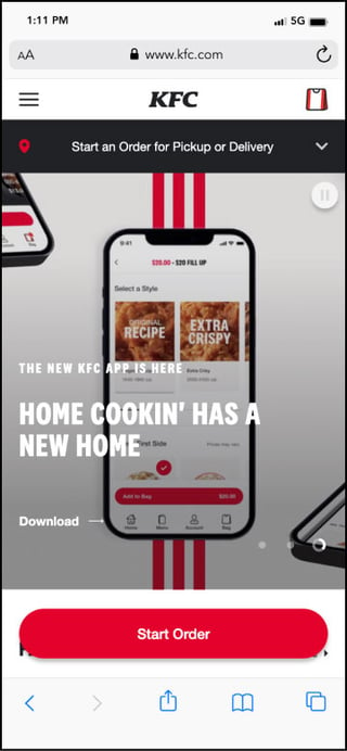
Following KFC's example, Wendy's can remove confusion and guide users to the next step in the food ordering process.
Usability Issue: Full Page Loading Screen
When a user picks either CTA button from the home page, a repeating animated loading screen opens. This animation does not offer any helpful feedback and only slows the users' ordering process.
Solution: Remove Extra Step
A better solution would be to remove the animation screen and send users directly to the next page. Better frontend engineering practices and asynchronous resource loading can correct this issue.
Usability Issue: Hidden Promotion Value
Wendy’s forces users to register before showing them the promotions they might receive. When users select the Offers button at the top of Wendy's menu, they are sent to a new modal screen asking them to sign up for rewards and exclusive offers. However, the site fails to list what offers the users will receive for completing this action, when all the user wanted was to view the special offers.
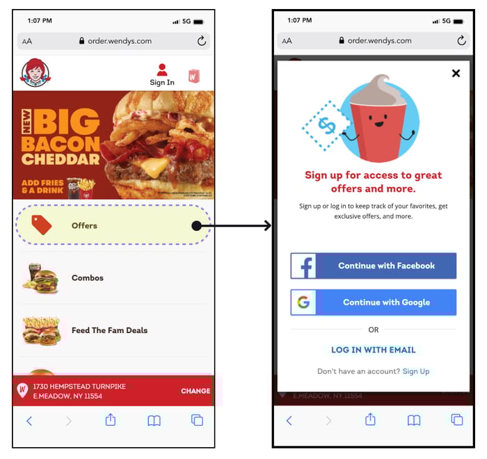
Wendy's screen shows that offers are available but does not specify what those offers are. If Wendy's were to clearly state the offer a user receives for signing up, they would be incentivizing users to create an account.
Watch a short clip of a user trying to navigate to the Offers. They quickly abandon exploring the promotions when they see the registration page.
Wendy's mistake is failing to supply information about the specific offers or deals(4), which causes users to hesitate.
Solution: Descriptive Text
Let's examine how Arby's encourages users to create an account. The text above the "Create an Account" form shows the value the user receives from creating an account.
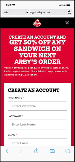
Wendy's could have used descriptive text to better position the benefit of registering for offers. A clear and concise description of offers reduces user hesitation and improves ordering flow.
Usability Issue: Lagging Response
Responsiveness is another usability issue on Wendy's site. The video below shows lag time. The user clicks a button and a noticeable amount of time lapses before the site responds. The delay between a user action and an interface update confuses users and slows the conversion process.
The videos below show how the site's slow response time creates a clunky user experience when building a combo.
The first video shows the user closing the drink selection instead of continuing with the selection.
The second video shows an incorrect “double tap” because the user didn’t realize the first click began to change the page.
This issue occurs when a user creates a combo from any page. The Doherty Threshold(5) UX rule tells us a waiting time of more than <400ms> will lower conversion rates because the user is out of sync with the process. Let's be honest, those 400ms can add up when all you want is a spicy chicken sandwich.
Solution: Unclear Feedback
Platform and industry conventions(6) suggest adding spinners, numbered steps, or other user feedback to fix the lag issue. By implementing the proposed changes, Wendy's could remove obstacles from the user's ordering journey.
The Nielsen Norman Group has published a helpful article addressing the lagging response issue: Progress Indicators Make a Slow System Less Insufferable(7).
Key Takeaway
Let Users Order First
The first strategy for creating a top-notch user experience is to offer customers an expedited checkout process. Without a seamless ordering process, user cart abandonment rates can rise to 68–75%(8).
Any interruption of the primary task of ordering and paying for food breaks the Principal of Don't Force Users to Register Before They Can Buy(9).
Conclusion
While interviewing users, we found that Wendy's site had issues preventing customers from completing their orders.
Look out for our next post, in which we will guerrilla test another fast-food eCommerce restaurant website and tackle UX issues with the Burger King site.
If you have questions or there are other sites that you want to see us discuss, join Bitovi's Discord Community.
Wendy's Site Map
To understand their usability problems, it’s helpful to understand Wendy’s overall eCommerce flow. The image below shows the significant steps on their site:
Click here to view a PDF version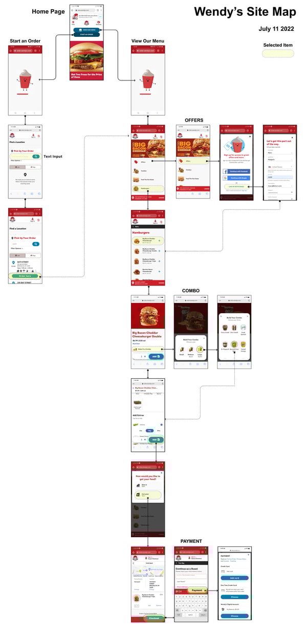
Footnotes:
- Lade Tawak: A beginner’s guide to guerrilla research: Oct 18, 2019. Accessed on: July 11, 2022 [Online]. Available: https://www.invisionapp.com/inside-design/a-beginners-guide-to-guerrilla-research/
- Unbounce.com: conversion-benchmark-reports: Accessed on July 11, 2022: [Online]. Available:https://unbounce.com/conversion-benchmark-report
- Rubik: Call for Attention. UI Design Tips on CTA Buttons: Feb 23, 2018: Accessed on July 11, 2022: [Online]. Available: https://uxplanet.org/call-for-attention-ui-design-tips-on-cta-buttons-5239413aded2
- Kim Salazar: Applying for Discounts and Promotions on Ecommerce Websites: June 2, 2019: Accessed on July 11, 2022 [Online]. Available: https://www.nngroup.com/articles/applying-discounts/?lm=ux-learn-in-restaurants&pt=article
- Doherty Threshold: Accessed on July 11, 2022 [Online]. Available: https://lawsofux.com/en/doherty-threshold/
- Rachel Krause: Maintain Consistency and Adhere to Standards (Usability Heuristic #4): January 10, 2021:Accessed on July 11, 2022 [Online]. Available: https://www.nngroup.com/articles/consistency-and-standards/
- Kate Kaplan: Progress Indicators Make a Slow System Less Insufferable: September 5, 2021: Accessed on July 11, 2022 [Online]. Available:https://www.nngroup.com/articles/progress-indicators/
-
Shopping Cart Abandonment Rate: Accessed on: July 11, 2022 [Online]. Available:https://www.geckoboard.com/best-practice/kpi-examples/shopping-cart-abandonment
- Amy Schade: Don't Force Users to Register Before They Can Buy: July 5, 2015: Accessed on July 11, 2022 [Online]. Available: https://www.nngroup.com/articles/optional-registration/
Previous Post