


.svg)


.png)
The heart of creating a LSG is the ability to put your documentation right where it belongs: in the source code. Chances are that you are already documenting your code, which is a great opportunity to take it to the next level by using a style guide generator that can turn those comments into an organized site, letting others (and yourself from the future) know why and what has been done in the code.
.gif)
Yourself from the future after reading the docs you wrote in the past.
Tutorial Part 3
In this part of the tutorial we will be documenting stylesheets in a living style guide and learn:
- How to add documentation to an existing stylesheet
- How to organize documentation
- How to break down style documentation into sensible chunks
- How to create sections in the living style guide
We will be using for this tutorial a sample application. For installation instructions check the previous tutorial part.
Documenting a Stylesheet
Documenting a stylesheet follows a similar pattern to documenting a page, but in this case the documentation will go inside of a comment, right next to the code (that’s the beauty!).
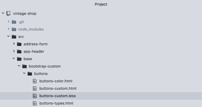
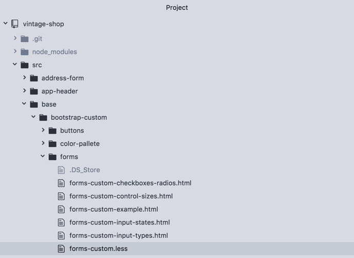
To get started open the stylesheet: buttons-custom.less .
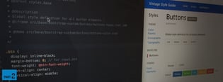
Inside of this file, and inside of a comment block, add the tag @stylesheet followed by two strings:
/**
@stylesheet buttons.less Buttons
*/
Note that the documentation comment needs to start with /** for the parser (in this case JSDoc) to recognized it.
Now let's break this down:
@stylesheet
The tag @stylesheet declares the file as a stylesheet and tells DocumentCSS that the information in this file should be displayed a such in the style guide. This serves to differentiate it from other types of documents, like pages, components, and models, among others (read here about the full list of document types).
buttons.less
This is the unique name for the stylesheet and is used as a reference to other tags. While you can use any type of name, I recommend using the name of the stylesheet file, as this will help finding the file when referencing the documentation. Do keep in mind that this will affect the url of your document. For this example the url will be: http://localhost:8080/styleguide/buttons.less.html
Buttons
Similar to creating a page, this is the title of the stylesheet that will be used for display purposes in the generated site. Here you can use multiple words with spaces or other characters.
To view the newly created page run the following command unless you have it watching for changes):
documentjsAnd then go to http://localhost:8080/styleguide/buttons.less.html to view the new page.
Now, let's add this new doc to our navigation. For this we will follow the same convention we used when we created the page by using the @parent tag:
/**
 * @stylesheet buttons.less Buttons
 * @parent styles.base
 */
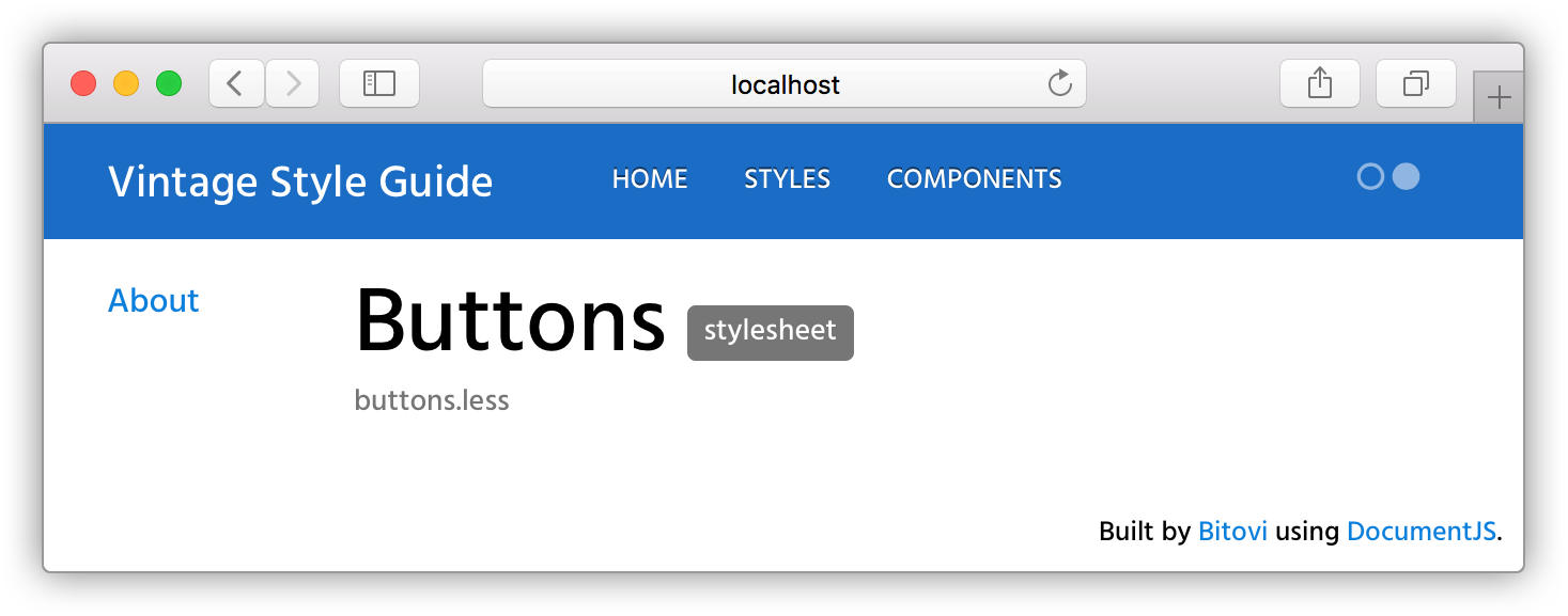
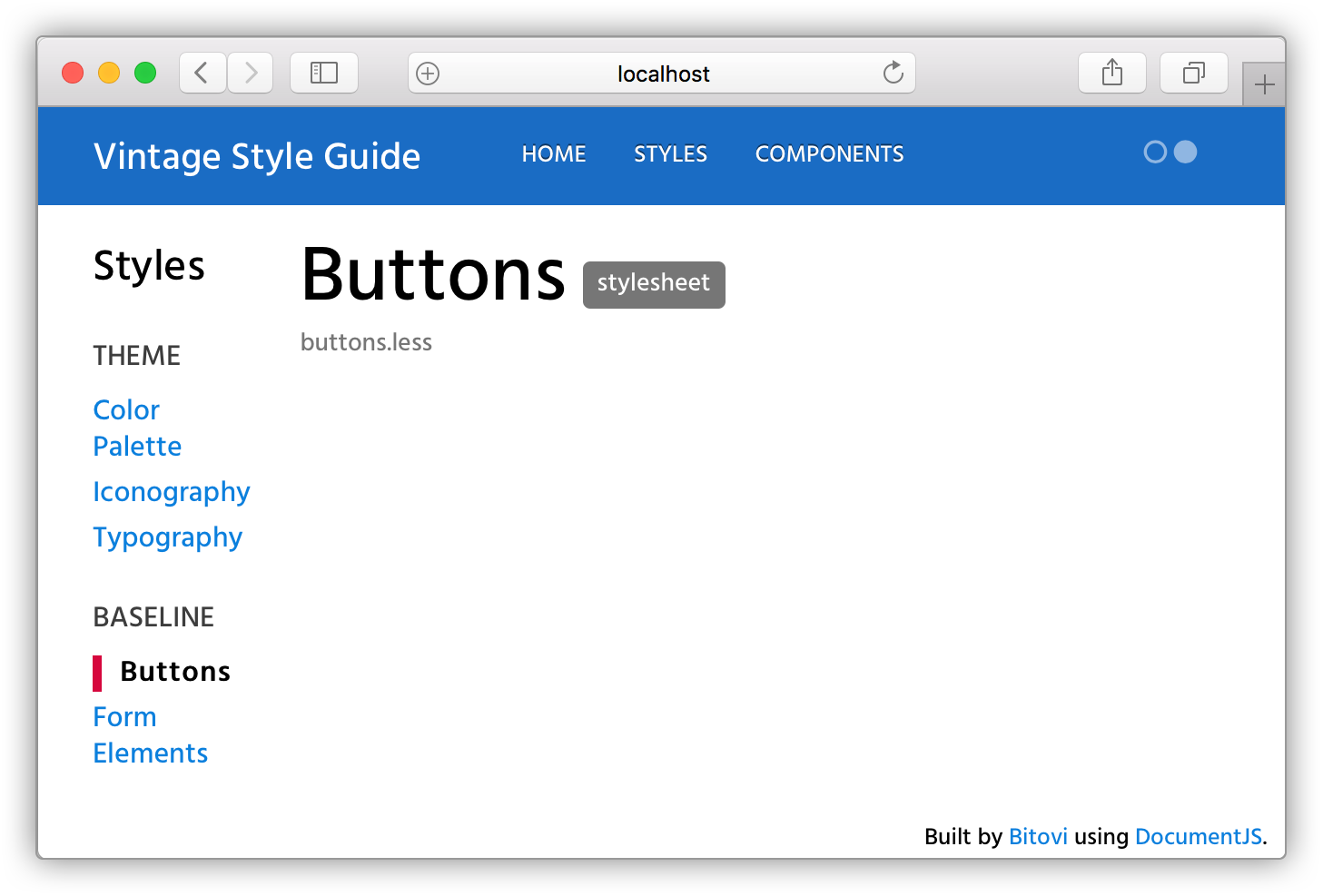
Note that in this case we have added .base to specify this page should appear under the group "Baseline" shown in the sidebar (you can also create groups in your subnav! We will dig into that in a little bit).
Re-running the docs and refreshing the page should look like this:
Now for the meaty part! With our page in place we can do a few things:
- We can add an overall description for the doc
- We can add all sorts of content using both markdown or plain HTML
- And best of all, we can add demos for our code 😎
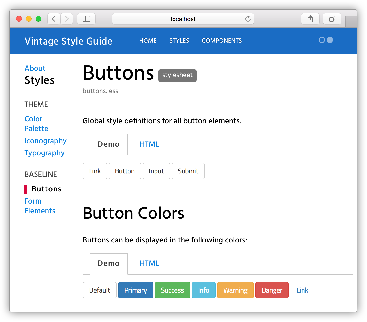
Let’s add a quick description and a demo for our buttons doc:
/**
  * @stylesheet buttons.less Buttons
  * @parent styles.base
  * @description
  * Global style definitions for all button elements.
  * @iframe src/base/bootstrap-custom/buttons/buttons-custom.html
  */
Rerun the docs, and 🎉:
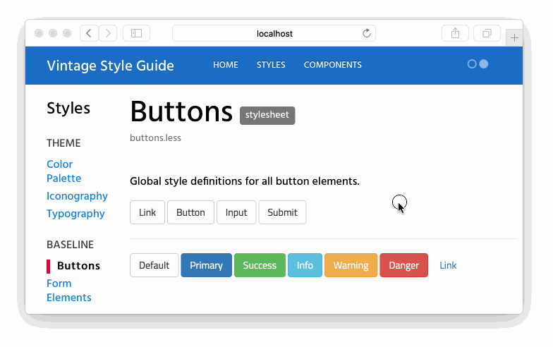
As you can see the @iframe tag allows to add an iframe with a demo to your doc. This demo is really just a simple html file with a script tag that imports the CSS of your app at run time.
Let’s open the demo buttons-custom.html :
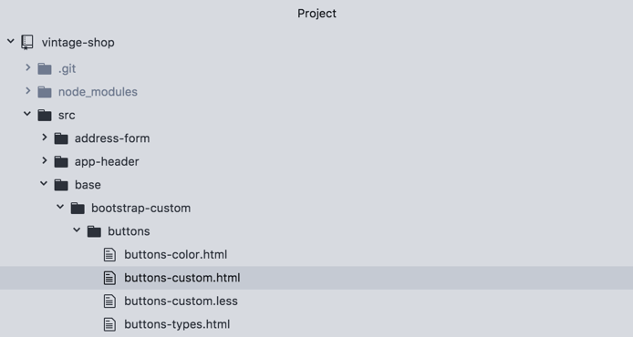
And see how the code looks like:
<script src="/node_modules/steal/steal.js" main="can/view/autorender/">
<import "vintage-shop/styles.less";
</script> <a class="btn btn-default" href="#" role="button">Link</a>
<button class="btn btn-default" type="submit">Button</button>
<input class="btn btn-default" type="button" value="Input">
<input class="btn btn-default" type="submit" value="Submit">

<hr />

<button type="button" class="btn btn-default">Default</button>
<button type="button" class="btn btn-primary btn-checkout">Primary</button>
<button type="button" class="btn btn-success">Success</button>
<button type="button" class="btn btn-info">Info</button>
<button type="button" class="btn btn-warning">Warning</button>
<button type="button" class="btn btn-danger">Danger</button>
<button type="button" class="btn btn-link">Link</button>
The only thing required in this file is the script tag, which should be the same for any demo that you create in this app. The rest of the code is the markup with the styles that you want to show in the demo.
Additionally you can use the tag @demo to also show the snippet of code used in it. Like this:
/**
  * @stylesheet buttons.less Buttons
  * @parent styles.base
  *
  * @description
  * Global style definitions for all button elements.
  * @demo src/base/bootstrap-custom/buttons/buttons-custom.html
  */
Which will output like this:
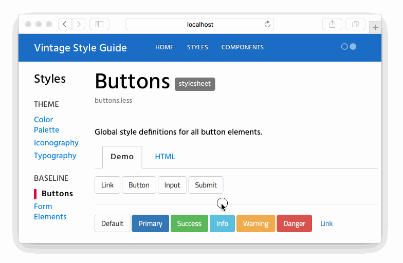
Demos credit goes to Bootstrap Docs where we snap the code from.
Now, before you go bananas with this, there are a couple of more goodies that you can take advantage of:
- Creating Style Sections
- Creating Stylesheet Groups
Creating Style Sections
To create a style section you can use the tag @styles. This tag is sweet because it allows you to break down your stylesheet doc into sensible chunks that you can talk about and understand better.
For instance, in our example, we have styles for defining buttons in general, regardless of the markup that is used ( either a <button/> vs <a/> tag). And then we have definitions of color. With the @styles tag we can break the color definitions into their own section, not only to talk about them separately, but to be able to hyperlink to that section directly.
This is how it works. In the same file buttons-custom.less, we are going to add the tag @styles right after the first block of styles and before the color variables. Here's how it should look like:
/**
  * @stylesheet buttons.less Buttons
  * @parent styles.base
  *
  * @description
  * Global style definitions for all button elements.
  * @demo src/base/bootstrap-custom/buttons/buttons-types.html
  */

  .btn {
    display: inline-block;
    ...}

/**
  * @styles buttons-colors Button Colors
  *
  * @description
  * Buttons can be displayed in the following colors:
  * @demo src/base/bootstrap-custom/buttons/buttons-color.html
  */

@btn-default-color: #333;- I updated the first demo to show only the button types.
- I added a new comment block using the
@stylestag. Here I gave it a unique namebutton-colorsand the title ofButton Colors. I also gave it a@descriptionand added a@demofor it that only shows the button colors.
And here’s the output:
Notice that the new comment block is now a section within the "Buttons" doc, which you can also access directly using this url: http://localhost:8080/styleguide/buttons-colors.html
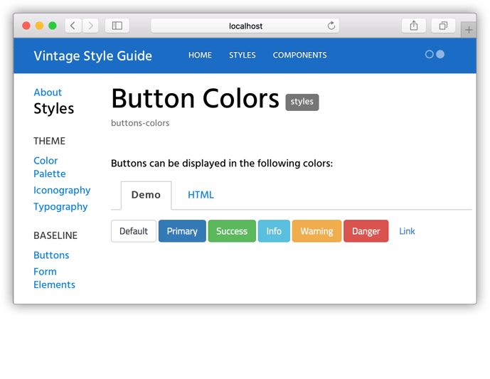
I personally find this super useful because you can point people to a specific section in the style guide, vs saying: "is in x page, under x section, then you need to scroll...and blah, blah, blah". Instead you can provide a direct link to it, and end of the story.
Creating Stylesheet Groups
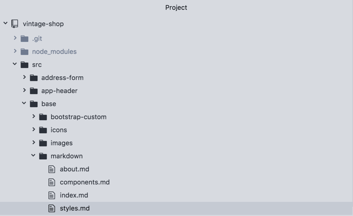
Additionally, you can also create sections or groups in the sidebar of the style guide. For this, open the file styles.md, located in the markdown directory.
You will notice here a new tag called @group.
@page styles Styles
@group styles.theme 0 Theme
@group styles.base 1 Baseline

The styles shown in this section show how elements are styles with definitions from the Bootstrap framework, in addition to any customizations made for this specific project. Therefore they will be available for use in any part of the application.
Now let’s break down the second line:
@group
The @group tag allows you to create a section in the sidebar that appears under the parent section. For example, the groups: "Theme" and "Baseline" will appear under the parent section of "Styles".
styles.theme
This is the unique name for the group. A good practice to follow here is to use the name of the parent section, in this case "Styles" as a namespace. In this way, if you want to create another group with the same name, but under a different section, the name of the group will remain unique.
0
This is the order in which the group should appear, which starts with 0. If no order is assigned, then the list of groups will be shown in alphabetical order.
Theme
This is the actual name that will show in the sidebar, so you can use multiple words with spaces and other characters.
To see groups in action, let’s add a new group as follows:
@page styles Styles
@group styles.theme 0 Theme
@group styles.base 1 Baseline
@group styles.forms 2 Forms

The styles shown in this section show how elements are styles with definitions from the Bootstrap framework, in addition to any customizations made for this specific project. Therefore they will be available for use in any part of the application.
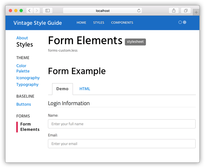
Finally, let’s add an existing doc under this new section. For this open the file forms-custom.less:
And on line 3, replace styles.base for styles.forms.
/**
  * @stylesheet forms-custom.less Form Elements
  * @parent styles.forms
  **/
Then run the docs and refresh the browser. You will now see the "Form Elements" doc under the group "Forms" in the sidebar.
Wrap Up
Living Style Guides are a tool to create more consistent and cohesive UI designs, and you can really take advantage of them when applying the Style Guide Driven Development Approach and when designing in a Modular Way.

You, building living style guides at this point!
At this point, if you have been following along you should now have a running Living Style Guide, and a well thought-out plan to create a LSG that you can use as a baseline for other projects. But if you haven’t be sure to check Part 1 (Planning Your Living Style Guide) and Part 2 (Creating a Basic Page).
 user experience