


.svg)


.png)
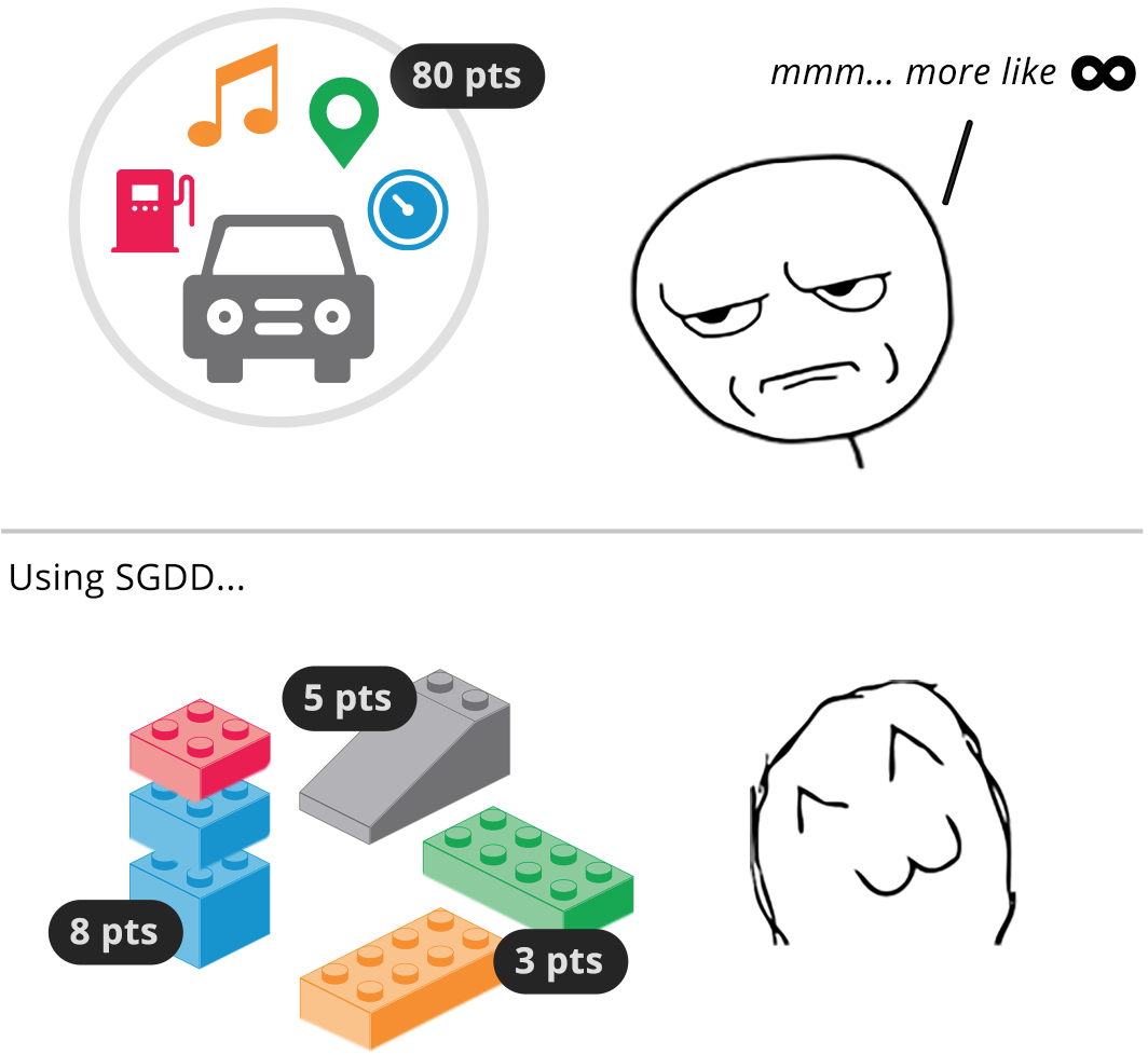
Style Guide Driven Development (SGDD) is a fairly new term I first heard from Nicole Sullivan’s talk about her experience on a project for Pivotal Labs. But thinking about some more, I realized SGDD is, at a high level, a practice many are already doing: developing components and documenting them in a style guide.
Why SGDD?
What’s interesting about SGDD is that it both provides a playground and a framework for development, isolated from the application’s implementation. This isolation encourages creating components in an abstract way, making them more reusable.
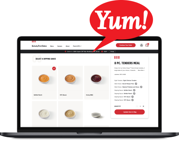
For example, instead of creating a toolbar for a specific view, the toolbar is created as a standalone component that can fit in many places. In the live style guide, all the different scenarios for implementing the toolbar can be documented.
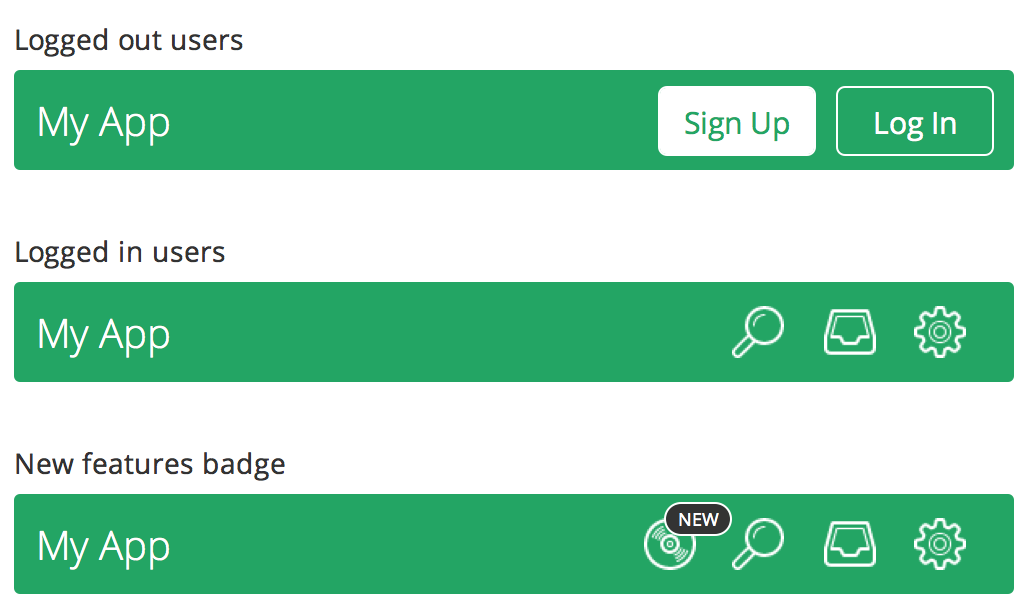
Controls are displayed side by side according to user permissions.
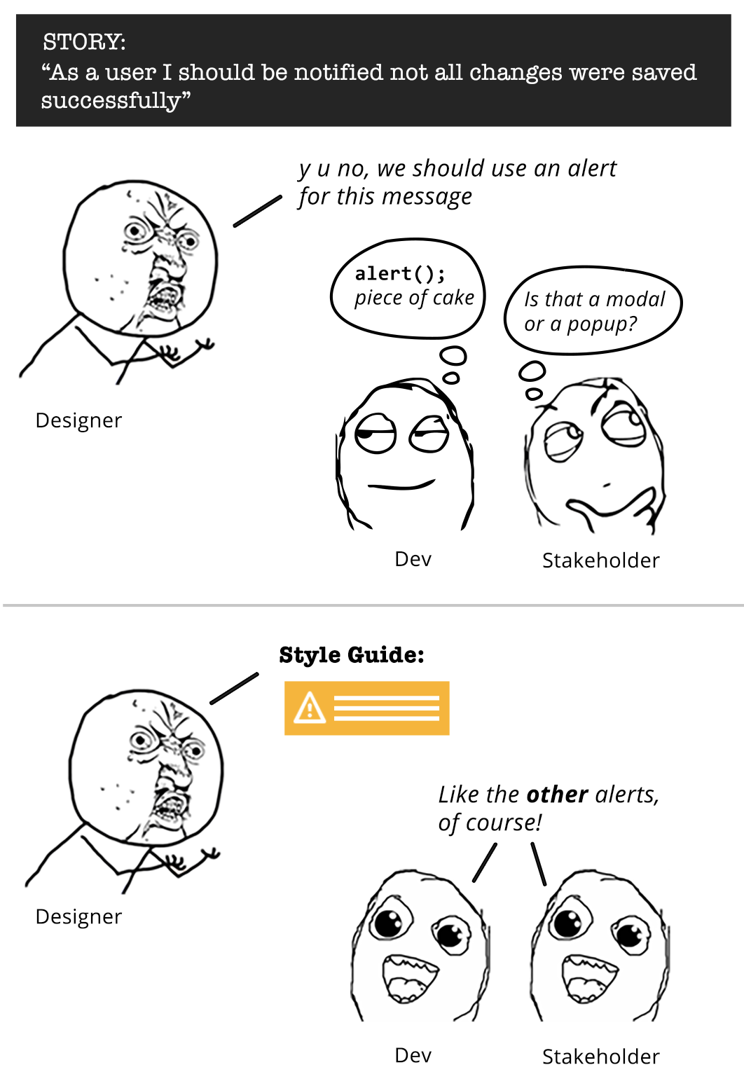
This type of documentation is a compelling tool for facilitating communication among teams. Without a guide like this, viewing the different states of a toolbar would require logging into the application with the appropriate credentials.
With these states documented in the live style guide, anyone on the team (from developers to stakeholders) can access them and see all the scenarios that are being covered. Likewise, as further development is done on the toolbar, it’s easier to see how the changes affect each of the views and code proactively.
Start by using a Live Style Guide
The first step to incorporate SGDD into your development process is creating a live style guide. Live Style Guides (LSGs) are living documents that are generated straight from the source code.

Unlike Static Style Guides that use static mockups, LSGs reflect the latest version of the implemented design and include demos showing interaction and behaviour.
Luckily, creating a Live Style Guide is getting easier as LSG generators are becoming very popular. There are now many open source tools to choose from. A tidy list for reference is this Overview of Pattern Library Generators created by David Hund.
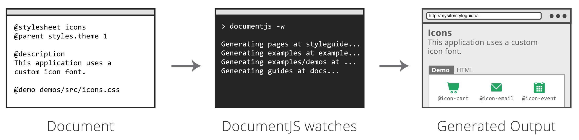
At Bitovi, we use DocumentCSS, a LSG generator powered by DocumentJS. DocumentCSS is a really neat tool as we can:
- Quickly install it using npm
- Configure where documents will be generated inside the project folder
- Use custom tags and markdown to structure the documentation
- Include live demos to show interactions and behaviour
- Run a command to watch changes on the source code and automatically generate the documentation
For instructions on how to use DocumentCSS on your project be sure to follow this guide and check the live demo.
The SGDD Process
Once you have a style guide in place and a system to automatically generate it, you can now take the style guide approach to development:
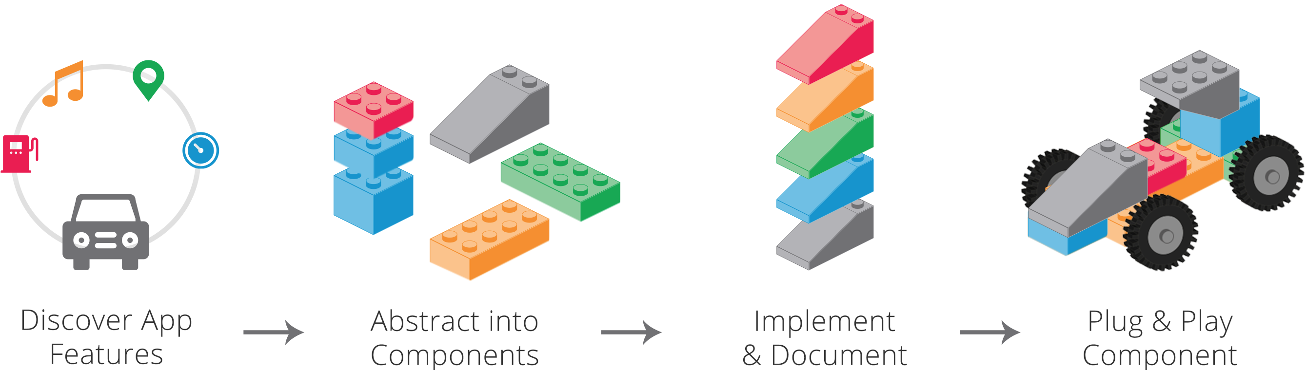
1. Discover the New App Features
This is when requirements are gathered and mockup designs are tackled. At this stage the LSG serves as a reference when creating designs. Traditionally, designers would be looking at a color palette, typography and other baseline elements to compose the new layouts, but with SGDD in mind, they can also consider if existing components can be reused or extended.
2. Abstract Into Components
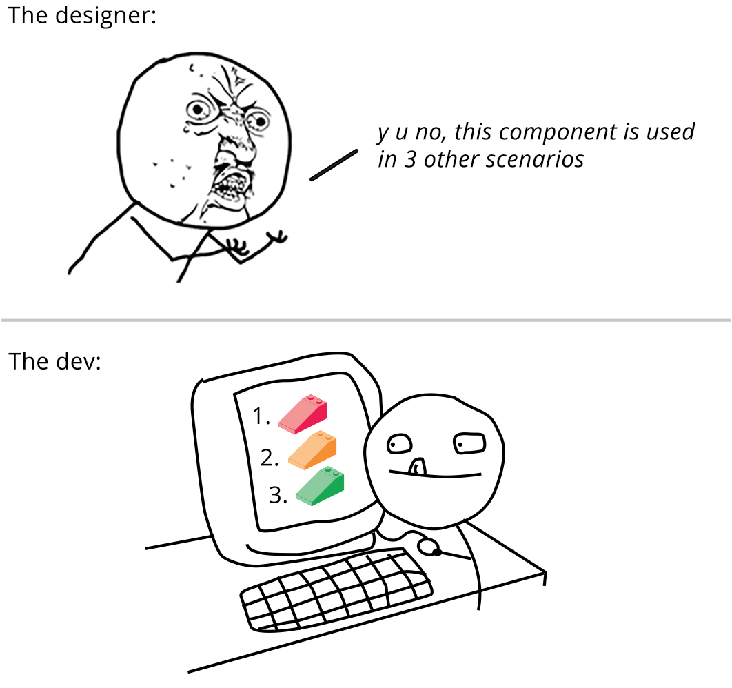
Once the designs are ready to be implemented, designers and developers can use the style guide to discuss how the new features should be broken down into separate components, which ones already exist, and which will need to be extended or created. This exercise has two purposes:
1. Understanding the designs
While design mockups or prototypes can provide a high level of detail as far as how the design should be implemented, there is always room for interpretation. Therefore, the designer-developer conversation guided by a live style guide serves as a way to close any gaps, ensuring more accuracy on the implementation.
2. Determining tasks/stories
Having a clear idea of what needs to be done paints a clear picture of the work that is ahead and makes it easier to break designs down into tasks/stories around the components that are needed for implementation and estimate “story points” (level of effort).
3. Implement and Document
In this part of the process the LSG becomes both a framework and a playground:
It’s a framework because it provides the rules that define how elements should look and behave. Creating the new component is about following the guide to make it fit as part of a whole, while providing enough flexibility to reuse it in different scenarios.

While the implementation takes place it's a good time to also start documenting. LSGs shine as documentation tools, as they make it easy to include information to describe how the components works along with code samples and interactive demonstrations.
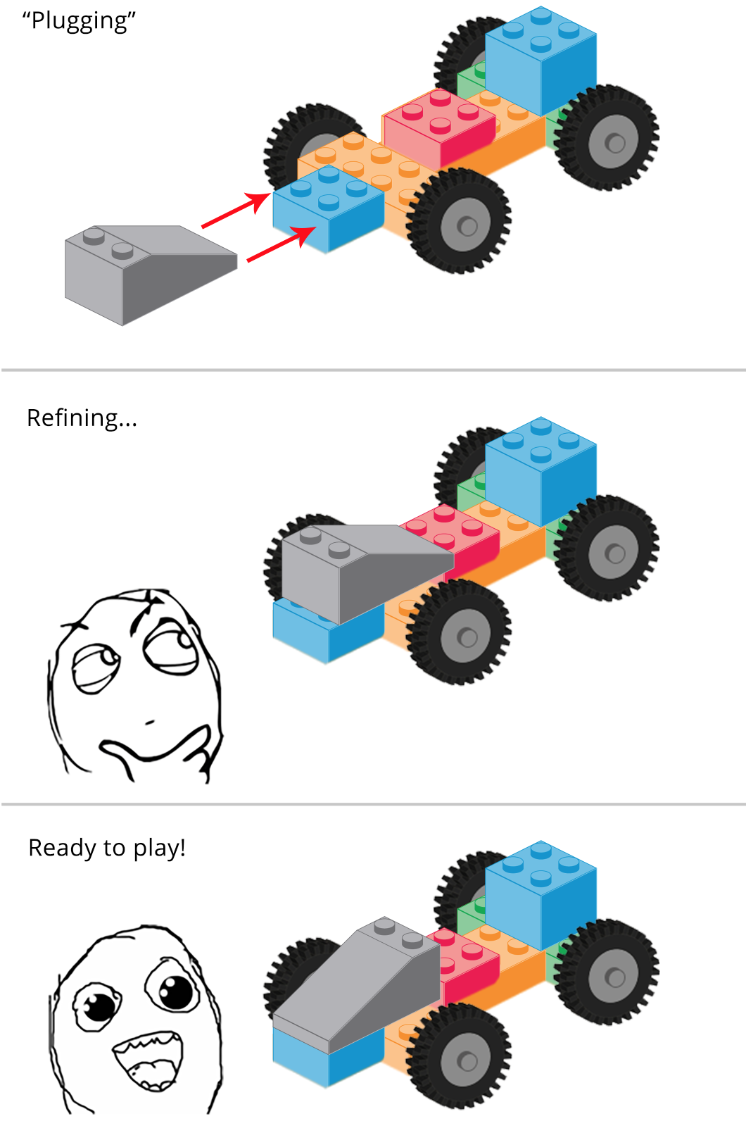
4. Plug & Play Component
Once the component has been made part of the pattern library, the final step is to plug it into the application. Because of all of the work done already, the component should be pretty mature and easy to “plug and play”. Of course, some refinement will be needed. Other scenarios not considered before may surface, but that is just part of an iterative workflow.
As refinements are done, going back to the documentation will serve to quickly show how the changes affect any other scenarios already documented. So while the component might be close to its final implementation, the dynamic nature of documenting and testing it on the LSG should continue, not only to ensure the component stays solid as refinements are done, but also to provide guidance for future development.
The Communication Benefit
As an efficient development workflow, SGDD eases the conversation between different members of the team. New members can quickly familiarize themselves with the patterns in the library, while designers and developers can discuss the design implementation by looking at interactive demos instead of getting lost in mockups and prototypes. Additionally, product owners, testers, and stakeholders can use the style guide to learn about the interactions and behaviors defined in the guide and reference them as needed.
In Summary
It’s no secret that documentation improves the workflow and communication among teams. What SGDD brings to the table is reinforcing the idea of breaking down development into bite-sized blocks using the LSG as a building tool (to create, test and document). This approach bridges the gap between interface design and technical information and boosts development time and team communication.
 development