


.svg)


While writing React apps, we often run into scenarios where we might need a component to render as different elements. These elements could be different HTML tags or other React Components. Have you ever run into any of the following scenarios :
-
Buttons and hyperlinks share the same design, but using the right HTML element is important to ensure accessibility. Screen readers rely on the rendered HTML element to announce the element to the users. Another important detail to remember is that we want to have the
<Button>component rendered as a<Link>component in the case of internal links to the app. All three scenarios<a>,<button>&<Link>, look the same, but behave differently. It would be way simpler to have a single component handles all scenarios than to maintain three different ones and sync them up every time there’s a small design change. -
A simple
<Header/>component that accepts text as a child and size as a prop and you might want to dynamically render as<h1>,<h2>,<h3>,<h4>,<h5>or <h6>tags. Having a single component handle this would be way simpler than handling six different components.
This post aims to provide a way to render different HTML elements based on props in React. But why do you need to render HTML elements like this?
-
Reduce the overhead of building & maintaining multiple components to support different elements.
-
Build semantic and accessible HTML by allowing you flexible components that you can render with an HTML element of your choice.
How to Create Components with Strings
Let’s implement a Button component that can be rendered as a <button> or an <a> and look the same from a UI perspective. Besides accessibility, you will benefit from keeping your component semantic, updatable, and flexible.
Before we dive in, remember that JSX is just syntactic sugar for React.createElement. You can try React.createElement yourself here.
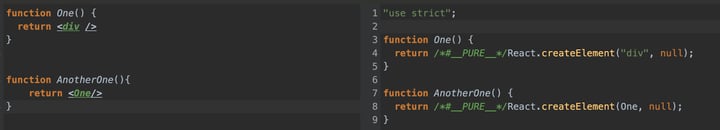
With this knowledge in mind, you’ll see how to create JSX Elements using strings. Let’s build out the first example mentioned above. Consider this simple Button component:
import React from "react";

export default function Button({ children, ...rest }: ButtonProps) {
  return <button {...rest}>{children}</button>;
}

export type ButtonProps = React.ComponentProps<"button">;
You want this component to be rendered as a Link or a button based on the props it has been passed. The goal is to make a component that will dynamically render both with the correct prop typings.
Going from JavaScript to TypeScript
Consider the following typeand interface to support all component types you want to render :
type ButtonRoots = "button" | typeof Link; // to support props of both components

interface BaseButton<Props> {
  <Root extends ButtonRoots>(
    props: GetPropsWithOverride<Root, Props>
  ): JSX.Element;
  (props: Props): JSX.Element;
}
This interface uses function overloading to define how your final BaseButton component can be utilized. The first overload :
<Root extends ButtonRoots>(
  props: GetPropsWithOverride<Root, Props>
): JSX.Element;
Define a generic called Root that extends ButtonRoots to only have “button” or Link passed into it. You also have a generic called Props to pass in any props that youy may want to standardize across your button and Link to enforce the same design (via className) or have the same children (icons).
The second overload is pretty straightforward.
(props: Props): JSX.Element; // Accept props of type ‘Props’ and return a JSX Element.For the time being, put a pin on what GetPropsWithOverride<Root,Props> might be and get back to it after you consume BaseButton in your final Button component.
Wouldn’t it be great to have a Button component that accepts a prop as a string (eg ‘button’) to let it know what it needs to be rendered as? That’s exactly what you’re going to do.
Creating a Button with Our New Types
Here’s how we want the Button component to look like:
export const Button: BaseButton<{
className?: string;
children?: ReactNode;
}> = ({ as: Component = "button", ...rest }) => {
  return <Component {...rest} />;
};
The most notable prop in the above component is the as prop. It determines how the component gets rendered and it utilizes the string “button” to render a <button>. The prop is destructured as Component because JSX elements have a requirement to start with a capital letter. Note that this is where our knowledge of JSX just being React.createElement comes in handy. The string "button" works because it gets parsed as React.createElement('button').
The second overload was needed to have the as prop to default to “button”.
The Button Component also drives home the fact the React function components are just JavaScript functions that return JSX elements.
Back to that Fancy Override Interface
As promised, let’s discuss the interface `GetPropsWithOverride<Root,Props>`. This will explain how ‘as’ came into the picture :
type GetPropsWithOverride<Root extends ButtonRoots, Props> = {
  as?: Root;
} & Props & Omit<React.ComponentProps<Root>, keyof Props>;
This interface accepts two generics: Root & Props. Root gets passed in as the as prop. It’s optional because you passed in a default ‘button’ value in the Button component. Props are the optional props “children” and “className” that get forwarded to this interface. The Omit utility removes the duplicate defaults and it allows your passed `Props` to take precedence instead.
You’re now ready to use your Button component in the following ways :
<Button as={Link} to={"/"} /> Link </Button> // renders a Link (needs to be wrapped in a Router)
<Button onClick={() => console.log("Button clicked"}>Button</Button> // renders as <button>
Conclusion
All tied together, this is how your final component and its usage look:
This example also supports <a> (anchor tags) merely by adding <a>. to ButtonRoots.
And voila, you can support Link, <a>, and <button> using the same piece of code. This same principle can be applied to a Header component where you can support multiple tags from h1 through h6. With this approach, you have learned a way to:
-
Keep your components flexible, and avoid having to write multiple components that almost do the same thing.
-
Make sure your components are accessible & semantic
-
Make sure any design change requests are tackled by updating a single component.
Need some help?
Bitovi has a team of expert React Consultants who are ready to dive in and help with anything from web components to suspense. Book your free consultation to get started!
Have thoughts?
 We’d love to hear them! Join our Community Discord to continue the conversation.