


.svg)


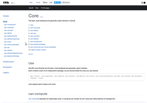
The redesign of the CanJS website required a way to create a fixed header and a fixed flexible sidebar that adjusts its width based on its content. The main content container also needed to flex to accommodate more (or less) sidebar content.
Here's a layout hack using Flexbox for creating your own HTML template with:
- A sticky header
- A sticky, flexible-width sidebar
- A flexible main content container (which changes width based on the content of the sidebar)
Understanding the Design
The main content container changes its width based on the width of the sidebar.
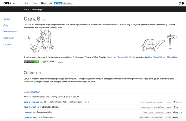
The sidebar and main content container scroll independently.
Create the Page Structure
First, set the height of the html and body containers to 100%. Then, create two columns inside the body that are flexible in width and span the height of the page.
The left column contains the side navigation and the left side of the header. The right column contains the page’s main content and the right side of the header. Enable scrolling within the sidebar and main content containers.

Note: You could place the header outside the two columns. Here, the header is within the columns to align the navbar links in the right header with the left edge of the main content container.
Shortcut: Starting HTML and CSS
Use this HTML structure as a starting point and add your own content:
<body>
    <div id="left" class="column">
        <div class="top-left"></div>
        <div class="bottom"></div>
    </div>
    <div id="right" class="column">
        <div class="top-right"></div>
        <div class="bottom"></div>
    </div>
</body>
And this CSS:
html {
    height: 100%;
}

body {
    height: 100%;
    overflow: hidden;
    margin: 0px;  /* removes default style */
    display: flex;  /* enables flex content for its children */
    box-sizing: border-box;
}

.column {
    height: 100%;  /* allows both columns to span the full height of the browser window */
    display: flex;
    flex-direction: column;  /* stacks the left and right headers above the bottom content */
}

#left {
    flex-shrink: 0;  /* makes sure that content is not cut off in a smaller browser window */
}

.top-left {
    flex-shink: 0;
}

.top-right {
    flex-shrink: 0;
    display: flex;
}

ul {
    display: flex;
    list-style: none;
}

.bottom {
    flex-grow: 1;  /* ensures that the container will take up the full height of the parent container */
    overflow-y: auto;  /* adds scroll to this container */
}
Learn More
Now you have an HTML template based on Flexbox.
Want to learn more about Flexbox? CSS-Tricks is a great place to start.
Want to see the full demo? Play around with it in JS Bin.
If you'd like to try a different variation of the sticky header layout, you can try Using CSS Grid to Build a Page Layout with a Sticky Header and Footer.
Have questions? Join our Discord and ask!
 user experience