


.svg)


.png)
User testing is a great way to validate assumptions and gain new insights about how people interact with our websites and apps. When it comes to eCommerce (and in particular mobile commerce or “mCommerce”) it’s critical to understand how people find and purchase products online. This was evident on one project where we were tasked with testing the mobile website design for retail membership giant, Sam’s. As it turns out, there are many common navigation patterns that aren’t nearly as effective as people might think.
Research Goals and Approach
The goal of our user testing was to answer several critical questions about how people used the retail website on their smart phones. Our research questions revolved around how users find products they know they want to purchase, whether our assumptions about the navigation icons were correct, and where people expected to find options for managing their account. User testing was one part of a larger project, which you can read about here.
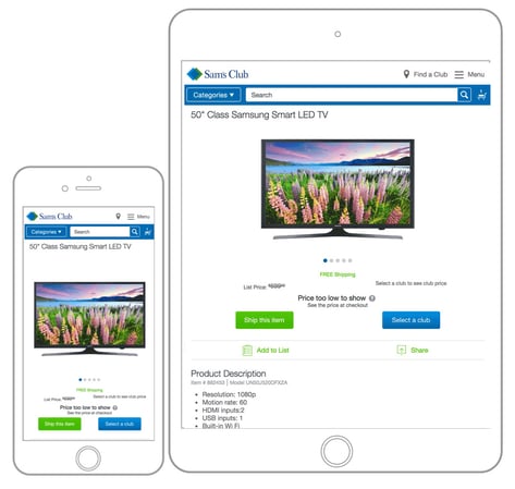
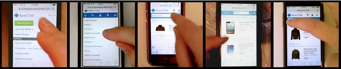
We started by creating prototypes of four different designs (using Axure), all of which we thought created a pretty good eCommerce experience on small devices. Then we wrote tasks for people to perform so we could observe which options they chose, whether they hesitated or had difficulty. The tasks were simple, “Find the store location nearest to you.” or “Find a jacket you would consider purchasing.” We asked participants to talk through their thinking out loud as they performed the tasks so we could better understand their thought process. This unmoderated, qualitative study was exclusively about observing people perform common tasks that would inform our decisions for the final navigation.
The first round of testing used the two designs we thought were most likely to succeed and tested them with an initial pool of 12 people in an A/B test: 6 got one design, 6 got the other. Based on that test, we modified the “winner” with our learnings and continued testing it against the other designs in 3 more rounds of testing with 8-12 people each. Each time we iterated on the two designs and presented them to a new pool of testers. Altogether, we watched about 42 people use different versions of the mobile site to perform the same set of tasks.
What we learned testing a mobile commerce navigation
The results from this testing heavily influenced our final design decisions. All of our initial research questions were answered (and in fact, it raised many more). However, some of the results were surprising and many were general observations that could be applied to any mobile eCommerce application. Here are some of the most interesting observations:
- People will quickly swipe the entire page (top to bottom) before making a decision
- People are afraid of “choosing incorrectly” and going to another page
- People like to “return home”
- Word + icon is better than icon or word alone
- A “catch all” menu can work for non-shopping tasks
- People prefer to browse or search in equal numbers
1. People will quickly swipe the entire page (top to bottom) before making a decision
Most surprising to me was how often people would swipe all the way to the bottom of the page and then all the way back up again before making a decision. Given a simple task like, “Login to your account” or “Find a jacket you’d consider purchasing” about 50% of our participants swiped the entire page before making a choice. This was obviously influenced by what options were exposed in the main nav. However, a pattern was clear that even when we thought the options were clear, many people preferred to quickly scan the entire page before settling on their choice.
What’s more, is that it seemed like people were swiping to the bottom of the page to look for a simple list of links. Our prototype included a list of common categories near the bottom, as well as some utility text links for Help, Privacy, and FAQs. Many people read through these lists before going back to the top of the page and choosing an option in the main menu.
This is very relevant to the discussion around mobile eCommerce design, or any mobile site design, because it’s common for designers or business people to argue that people won’t be able to find something further down on the page. The entire “above the fold” conversation becomes irrelevant when you see people use your site like this. Further, if the simplest or expected solution for finding an item is scanning a list of navigation items at the bottom of the page, it’s worth putting some thought into the footer of your site. The idea of offering a “catch all” list of common links might sound ugly, but it’s probably practical for a lot of people.
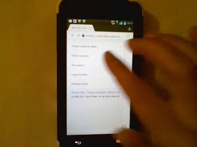
This person swiped to the bottom of the page, scanning the options, before going back to the top and making a choice.
2. People are afraid of choosing “incorrectly” and going to another page
I was surprised by how many people hesitated to make a choice because they were unsure of what would happen next or (if they made a mistake) whether they would be able to recover from it. This seemed to reveal an anxiety about loading another “page” - which was perceived to take time - whereas controls that appeared to only open a dropdown menu were easier to choose.
 A dropdown arrow seemed to allay concerns about going to a new page.
This hesitation was valuable in that it allowed us to understand which parts were more ambiguous, because they acted more quickly when they had more confidence about their choice. But even in cases where they verbally affirmed what they expected to happen, many people still hesitated to commit.
The learning for us was that we need to expose as much of the interface as possible to avoid creating a misunderstanding that they will be taken to a different place to perform simple actions. The best example we observed was with search. When we only displayed a search option without a visible input, people hesitated to use it thinking it would take them to a search page. Actually, tapping search revealed the text input right there.
But when the search text input was exposed by default, it communicated that they could search without going anywhere. Both designs required the same number of taps to search, they just had slightly different interactions. Yet, the one that visually exposed the input was more clear.
3. People like to “return home”
While it wasn’t universal, there were a number of participants across each test who preferred to go back to the homepage after each task - rather than perform the next task from the navigation (which was the same across the entire prototype). It’s possible that some of these people simply wanted the test itself to be “accurate” and assumed they needed to start over each time, but I suspect a number of them were actually more comfortable going back for a fresh start each time. We would need to test this more to know for sure, but the observation is noteworthy and confirms an overall theme that people aren’t confident in the system’s ability to respond the way they expect. One way to guard against this failure, is to return to your initial, pure state. Much like people are (sadly) accustomed to restarting their computers, people using websites may expect they’ll get better outcomes by “resetting” their experience with each new task.
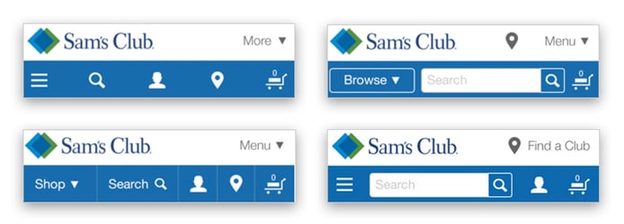
4. Word + icon is better than icon or word alone
We tested a handful of variations on common navigation items. Some used only an icon, some used only words, and some used both. We saw more confidence from people when they had both an icon and a word to help them make a choice. Icons can be subjective and even certain words mean different things to different people, so combining them reinforced the meaning and gave people more confidence in their choice. Additionally, as some people are more visual than others, the combination of icons and words appeals to a broader population.
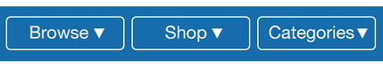
The takeaway is that we should always strive to find the right combination of icons and words, especially for the most business-critical tasks. This is difficult on mobile where space is limited, but an icon only toolbar is not going to help people find your products nearly as much as a combination. Similarly, using only words will be ineffective if people have a different idea about what an individual word means. In this study, the words Browse and Shop were not as universally understood as the word Categories. I suspect this is because “Categories” describes the content underneath the menu, rather than the verb that we think people might associate with it. I don’t know, but “Departments” might work equally well.
(Related: I was surprised to find that the map pin icon and user silhouette icon performed well for finding the nearest store and accessing account information - without a word next to it. I had expected them to be confusing to some people, but the majority used them right away.)
5. A “catch all” menu can work for non-shopping tasks
I was impressed with the number of people that expected to find non-shopping tasks (like Account, Login, or Orders) underneath general options like “Menu” or even the loved/hated hamburger icon. It surprised me for two reasons. First, I’m personally opposed to creating a garage-sale menu that gets stuffed with anything we can’t decide on. It seems like a lazy solution to something that could be solved better with a little information architecture (IA) forethought. Second, I’m a firm believer that the hamburger icon is meaningless to most people outside the techno-elite, but people seemed to correctly choose the hamburger icon or the word “Menu” in equal numbers.
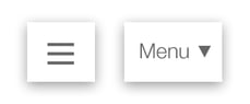 I was surprised (disappointed?) that people seemed to correctly choose the hamburger just as often as the "Menu"
Still, it’s worth noting that people still expected to find shopping related controls in the main nav. When “Browse by Category” was underneath a single main menu icon, some people didn’t find it at all. My assumption is that people expect the primary interface for an mCommerce site to expose all options for categories, search, and cart - whereas other utilities can be safely organized underneath a main menu. I’ll temper this by saying that I still think we should be careful not to create a trash bin of menu options that people have to wade through. The point is that this “catch all” menu performed better than I would have expected and, therefore, we shouldn’t be afraid of it.
6. People prefer to browse or search in equal numbers
In the era of Google and smart suggestions, it’s surprising to me that anyone would want to manually drill down through a tree of categories to find a product… but they do. When we presented people with equal access (and size and visual weight) to both “Categories” and “Search” they chose either option equally. It turns out some people prefer to browse categories while the same number prefer to search.
I have a hard time understanding this because I find search engines to be faster than even finding my own saved bookmarks. Even on my computer’s file system, it’s much faster to search everything than it is to manually traverse the folder structure. But not everyone is like me (thank goodness!)
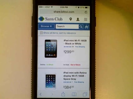 When Browse and Search were equally exposed, people took advantage of them equally.
There could be a few reasons for this. One is that not everyone will know the right words to search for. Perhaps, as we’ve already seen, they’re afraid of searching for the wrong thing and so they’d rather navigate through the site on the site’s terms. This again goes back to the trust they have for the system, but it’s entirely possible that many people have had bad experiences searching and they believe they’ll get more accurate results by choosing from a predefined list instead of hoping the computer can understand what they typed.
The point is that different people do things differently and we shouldn’t necessarily push search over categories or vice-versa. It’s important to allow people the freedom to find products in their own way. That might mean giving equal weight and importance to both search and browsing options.
In Conclusion, People Don’t Trust Your Website
If I had to summarize all of these learnings into one cohesive theme, it would be that people don’t trust websites to help them. Deep down inside, they don’t have complete confidence that “the system” is going to behave in predictable, useful ways. As a result, they guard against errors and overcompensate for the potential for error. Many people are starting out from a position of distrust, even if they’re not consciously aware of it. Unfortunately, that’s not an issue that can be solved in an instant.
However, it does present an opportunity to design a mobile eCommerce navigation that will earn that trust back after a few interactions. In summary, our mobile nav can take into consideration these learnings:
- Make sure finding products is the primary function of the navigation and that the different ways of finding products are equally accessible
- Avoid taking people to a different page if the same can be accomplished with an overlay menu, expanding panel, or simply updating the interface inline
- Combine text and icons where possible to give people confidence that they understand what they’re choosing
- Design pages for quick scanning using simple lists. Don’t “hide” options underneath an additional interaction if it’s possible to expose it, even if it’s not as pretty
- Allow users to easily recover from errors without losing their place or data.
Have you done user testing on mCommerce that yielded similar or different results? Post a comment to share your experience and let’s learn from each other.
 user testing