


.svg)


Legibility is often thought of in regards to handwriting—whether your homework is sloppy or neat. But did you know that legibility applies to digital text as well?
Legibility in UI design is especially important when you’re looking at interactive mediums and not just static words. Whether it’s causing eye-fatigue or the text cannot physically be read, poor legibility can destroy an otherwise good product and user interface.
What makes digital text legible? Is it the size of the words or the type of font? Yes, and it’s also a bit more complex. Let’s dive in and learn more about the 5 tenets of legibility in UI design.
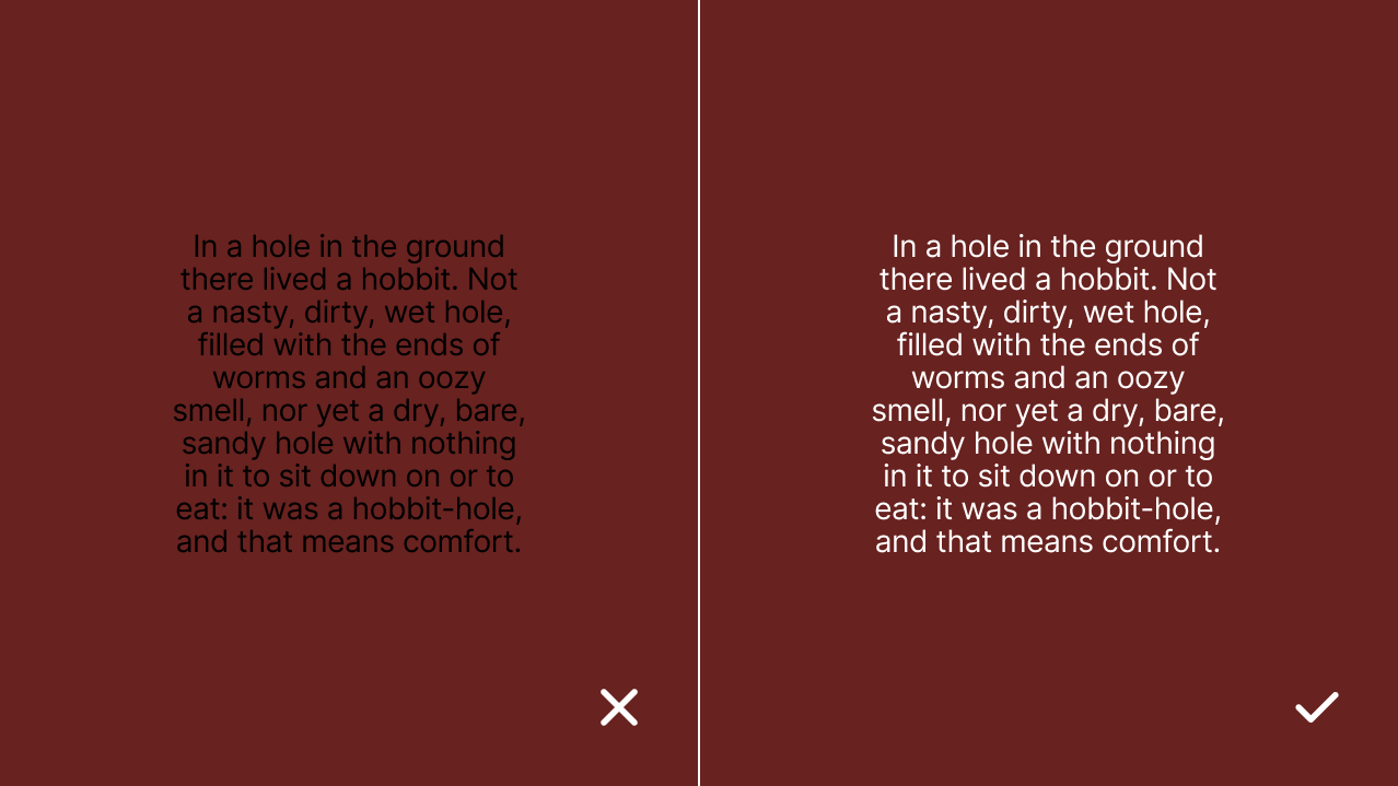
1. Contrast
Being able to distinguish between text and background is necessary for legibility. This is achieved through color variations and brightness variations, which is why it is common to see dark text on a light background or vice versa.
To verify you have a sufficient amount of contrast to accommodate all levels of visual capability, you can run your foreground color and background color through WebAIM’s Contrast Checker.1
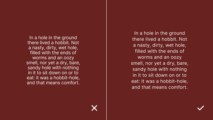
2. Spacing
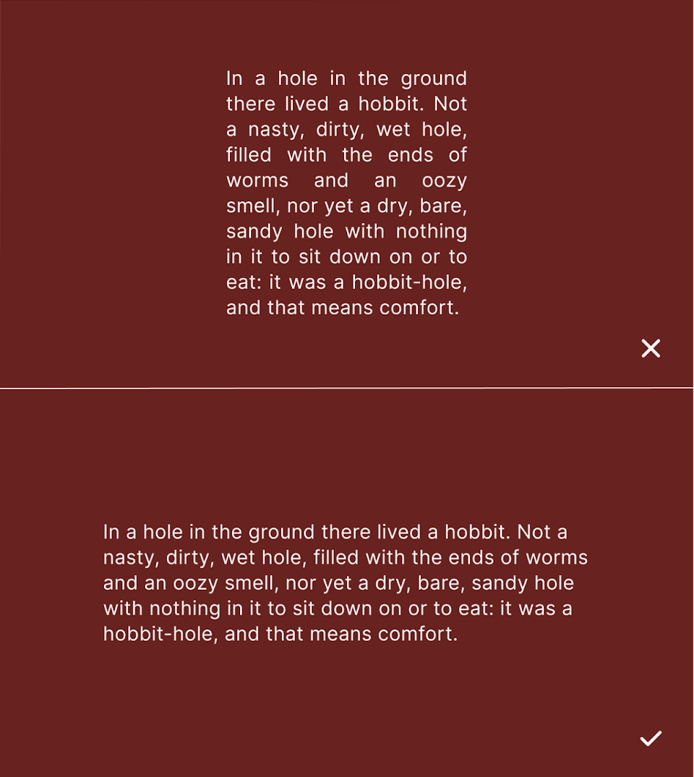
There are many types of spacing in UI design. When it comes to legibility, the two most important types are character spacing (tracking) and line spacing (leading). Character spacing is the horizontal space between individual letters in a word and between words. Line spacing is the vertical space between the lines of text.
When character spacing is too tight, it becomes difficult to distinguish between letter shapes, which forces readers to slow down. When line spacing is too tight, it becomes difficult to stay on the correct line while scanning, which again, slows down your reader.
However, it’s also possible to have too much space between lines and characters. When the spacing for tracking and leading is too large, the reader has a hard time associating the letters, words, and lines of text with each other.
Don’t worry—there is a happy medium between having too much space and not enough. Increasing the character spacing by a mere 1.5% from a font’s standard makes text noticeably more readable. Likewise, according to an eye-tracking experiment2, the optimal line spacing is 1.3x the font size.
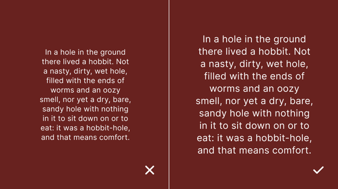
3. Size
The general consensus is that the larger the font size, the easier it is to read. When it comes to reading on digital devices like phones and tablets, this idea holds true. The same eye-tracking experiment2 referenced earlier showed that increasing the font size up to 18 points shows improved legibility, but the differences becomes negligible once the size increases above 18.
If the font size becomes too large, it changes the familiar flow of reading. Our brains are used to taking in a certain amount of text across a horizontal line. Oversized text forces less words on a single line and makes the reader reset their eyes from the end of one line to the start of the next.
4. Style
Equally as important as font size is font style. The two main types of font styles are serif and sans-serif. There are others: script, display, monotype, etc. but none of these should be considered realistic candidates for blocks of text.
Between serif and sans-serif, many have claimed that one or the other is superior for body copy, headline copy, print copy, or digital copy. But the results from actual studies have come back inconclusive. A doctorate of philosophy thesis by Ole Lund states the differences are “so peripheral to the reading process that this effect is not even worth measuring.”3
There is no need to dwell on the style of font you’re choosing, as long as it is a conventionally designed and reputable serif or sans-serif typeface, the legibility will be comparable.
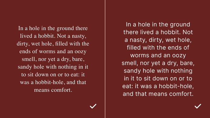
5. Layout
The fifth, and perhaps most important, tenet of legibility in UI design is layout. The way that words are laid out affects the flow of reading more than font type or size. For legibility, the best case scenario is to have left-aligned text with a ragged right edge and 65 characters per line.
When readers transition between lines, they can sometimes get lost and end up on the wrong line. Having a consistent starting point on the left side goes a long way in identifying the correct place to start. This is where left-alignment shows its strengths.
The right side of the text also affects legibility. Here we will see either justified text or a ragged edge.
Justified text is both left and right aligned. This may seem cleaner, but that is only the case when a designer has examined every line of copy to make it look nice. A good ragged edge is jagged and follows a long-short-long-short pattern on each line. This also takes some time and effort to achieve, but significantly less than justified copy. Having a good ragged edge on the right side is the best option for quickly formatting legible copy.
Once your text is aligned correctly, you’ll need to consider how long you want your lines to be. The ideal number of characters per line has long been considered to be between 45 and 75. Taking into account your font, font size, and character spacing, you should easily be able to find a text box width that averages in the middle of this range.
Conclusion
Now that you know the 5 tenets of legible UI design, you’re ready to design with text that’s comfortable and quick to read. When taking into account contrast (color and brightness), spacing (character and line), font size, and layout; your content will be more legible and user friendly. This will improve the experience of your product for your users!
Ready to Learn More?
Bitovi has a team of Product Design experts ready to make your project shine! Book your free consultation and get started today.
References
Previous Post