


.svg)


Are you developing reusable components for your Angular application? Creating buttons for your new enterprise design system? Adding a popover to a table? If so, you’ll almost certainly find yourself reaching for one of Angular’s most powerful tools: Content Projection.
Content Projection is a technique for dynamically injecting content into components, making it straightforward to create reusable building blocks for your Angular applications. In this blog, you’ll learn how to use Content Projection and ng-template to build a reusable dropdown menu quickly.
Example Project: Dropdown Menu
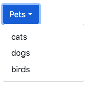
Imagine that you’ve been asked to implement a dropdown menu like the one above. The first use-case is to display a list of pets, but the menu must be flexible enough to display any type of data. Here’s a quick list of requirements:
-
Button text should be configurable per menu instance (not hard-coded to “pets”)
-
Menu contents should be configurable
-
Menu rows should support styling based on contents
What is Content Projection?
Content Projection is Angular’s system for “casting” content into components. Think of Content Projection like a movie theater: the component is the screen, and the “projected” content is the movie on the screen. The screen itself does not create the movie, rather it creates an opening where the movie can be displayed. Content Projection works the same way, allowing one component to “project” content into a designated space within another.
In the dropdown menu, your dropdown component will be the “screen” and an outer component will “project” each row in the menu. You’ll use to ng-template to define the contents of each row, and a Template Outlet to render each row in the dropdown menu. Let’s get started!
Create DropdownMenuComponent
If you don’t have an Angular project started, this would be a good time to create one! Once your project is set up, create a new component named dropdown-menu and update it to match the snippet below:
// my-project/dropdown-menu.component.ts

export class DropdownMenuComponent {
  @Input()
  title: string;

  @Input()
  rowItems: any[];

  @Input()
  rowItemTemplate: TemplateRef;

  show = false;

  constructor() { }
}
Next, add the following markup to the component’s template:
// my-project/dropdown-menu.component.html

<div class="dropdown">
  <button
      class="btn btn-primary dropdown-toggle"
      type="button"
      (click)="show = !show">{{title}}
  </button>
  <div class="dropdown-menu" [ngClass]="{'show': show}"></div>
</div>
The example above includes menu classes from Bootstrap. The classes are for appearances only and can be replaced with your favorite styles
The first requirement for configurable button text is fulfilled via the title Input, which is displayed inside a button on dropdown-menu.component.html:7.
Next up is the rowItems array. The rowItems array will be used to pass row contents to the dropdown component; each item in the array will be displayed as a row in the menu. Since the menu is designed to display a mix of content, the rowItems array is deliberately typed as any. Last is a boolean member named show, which is used to toggle the menu.
The markup above results in a button with text, along with a toggle-able menu. One thing still to add—The menu rows themselves!
Add Template Outlet with Context
The next step is to set up a Template Outlet. A Template Outlet is just like the Router Outlet directive, except it displays a template instead of a component.
Take a look at the rowItemTemplate component member: you’ll notice it is typed as a TemplateRef. This is Angular’s type for representing templates (aka the thing that your HTML goes in). As the name suggests, this template defines the content of each row in the menu.
The template outlet will be placed within the *ngFor that iterates the rowItems array. Each row item will be displayed in its own Template Outlet. Update the DropdownMenu template to match the following:
// my-project/dropdown-menu.component.html

<div class="dropdown">
    <button
      class="btn btn-primary dropdown-toggle"
      type="button"
      (click)="show = !show">{{title}}
    </button>
    <div class="dropdown-menu" [ngClass]="{'show': show}">
        <a class="dropdown-item" *ngFor="let rowItem of rowItems">
            <ng-container
                [ngTemplateOutlet]="rowItemTemplate"
            >
            </ng-container>
        </a>
    </div>
</div>
Now that you have an outlet for your template, it’s time to pass the rowItem so it can be displayed in the UI. This is accomplished by adding a “context” Object which can pass key-value pairs to the rowItemTemplate. Add the [ngTemplateOutletContext] attribute to your template, as seen below:
// my-project/dropdown-menu.component.html

<div class="dropdown">
    <button
      class="btn btn-primary dropdown-toggle"
      type="button"
      (click)="show = !show">{{title}}
    </button>
    <div class="dropdown-menu" [ngClass]="{'show': show}">
        <a class="dropdown-item" *ngFor="let rowItem of rowItems">
            <ng-container
                [ngTemplateOutlet]="rowItemTemplate"
                [ngTemplateOutletContext]="{$implicit: rowItem}">
            >
            </ng-container>
        </a>
    </div>
</div>
By default, Angular will pass the $implicit to the template as the first variable. However, Angular will accept keys of any name along with an unlimited number of context variables.
Create Pet List Menu Instance
Now that you’ve created a reusable dropdown, it’s time to instantiate it with some data. Let’s list some pets!
Below is a basic implementation of a PetList component. Each of its members will be used to populate the DropdownMenuComponent in the template.
// my-project/pet-list.component.ts

@Component({
  selector: 'app-pet-list',
  templateUrl: './pet-list.component.html',
  styleUrls: ['./pet-list.component.scss'],
})
export class PetListComponent {

  menuTitle = 'Pets'
  pets = ['cats', 'dogs', 'birds'];

  constructor() { }
}
Next is the PetList template. At the top is an instance of the dropdown menu, with the menuTitle and rowItems passed as Inputs. The rowItemTemplate Input is assigned to a template variable called petTemplate, which is declared on the pet-list.component.html:9.
// my-project/pet-list-component.html

<app-dropdown-menu
  [title]="menuTitle"
  [rowItems]="pets"
  [rowItemTemplate]="petTemplate">
</app-dropdown-menu>

<ng-template #petTemplate let-pet>
    <span>{{pet}}</span>
</ng-template>
At runtime, Angular will automatically map the $implicit variable from the previous step to the local variable named let-pet. Finally, the pet name is displayed within a set of <span> tags.
Benefits of Content Projection
The key benefit of Content Projection is flexibility. Since the row template is defined outside the DropdownMenu Component, you can style each row to meet your requirements!
Imagine your designer asks for the pet names to be capitalized. Without Content Projection, you might need to capitalize the pet names before they are fed into the dropdown menu, like this:
// my-project/pet-list.component.ts - capital pet names (alternate solution)

@Component({
  selector: 'app-pet-list',
  templateUrl: './pet-list.component.html',
  styleUrls: ['./pet-list.component.scss'],
})
export class PetListComponent {

  menuTitle = 'Pets'
  pets = ['Cats', 'Dogs', 'Birds'];

  constructor() { }
}
Fortunately, Content Projection allows you to de-couple the UI requirements from your data. Since the row is formatted in its own template, you can use Angular’s built-in TitleCase Pipe to solve this problem:
// my-project/pet-list.component.html - captial pet names (improved solution)

<app-dropdown-menu
  [title]="menuTitle"
  [rowItems]="pets"
  [rowItemTemplate]="petTemplate">
</app-dropdown-menu>

<ng-template #petTemplate let-pet>
    <span>{{pet | titlecase}}</span>
</ng-template>
Adapting to Changes with Content Projection
Let’s imagine another scenario. There’s been a change and “pets” is now an array of Pet objects: will the DropdownMenu need to change?
// my-project/pet-list.component.ts (Pet data-type example)

export interface Pet {
  name: string;
}

@Component({
  selector: 'app-pet-list',
  templateUrl: './pet-list.component.html',
  styleUrls: ['./pet-list.component.scss'],
})
export class PetListComponent {

  menuTitle = 'Pets'
  pets = [
    {
      name: 'dogs'
    },
    {
      name: 'cats'
    },
    {
      name: 'birds'
    },
  ];

  constructor() { }
}
// my-project/pet-list.component.html - captial pet names (Pet data-type)

<app-dropdown-menu
  [title]="menuTitle"
  [rowItems]="pets"
  [rowItemTemplate]="petTemplate">
</app-dropdown-menu>

<ng-template #petTemplate let-pet>
    <span>{{pet.name | titlecase}}</span>
</ng-template>
The answer is “no!” Since the contents of the dropdown menu are decoupled from the DropdownMenu Component, no changes are needed to support this new data structure. The reusability test has been passed, this component is ready to be used anywhere in your Angular application!
Wrap-Up
Reusable components allow you to reduce time spent re-implementing similar features, along with the long-term costs of testing and maintaining all that extra code. Content Projection makes it easier to support this critical feature, and serves as the foundation for countless component libraries and design systems in the Angular ecosystem.
Interested in learning more about Content Projection? There’s a whole second tool called ng-content, which you can read about here!
We’re Here to Help!
Still have questions about building reusable components and architecting scalable code? We’d love to help! Schedule your free consultation today.
Previous Post

Next Post