


.svg)


Ready for brand new CSS magic?

If you’re writing a sharable component or library and want to provide your dev-users an API that has CSS options like --size: sm; | --size: md; | --size: lg;, it’s actually possible to do so in CSS—without involving JavaScript, a build system, or Style/Container Queries—thanks to a new technique I’ve named “Type Grinding.”
Type Grinding allows your design tokens (keywords, or “<custom-ident>” values) written in your CSS to be transformed into any other values - like width, padding, color, etc - without relying on anything outside of CSS.
Edit the tokenized CSS values below to see how it feels:
The limiting factor for browser support is the ability to use specific syntaxes for the CSS @property syntax syntax, including:
- the | combinator,
“<integer>”syntax,- and custom-ident keywords (such as
“big | bigger | BIGGER”from the spec’s examples)
The current global user support is 72.77% according to caniuse—specifically chromium-based browsers.
I’ll be destructuring the CSS to teach you how it works, bring awareness to what’s possible, and hopefully empower you to do it yourself! (and I would LOVE to see what you do with it!) Let’s get started.
In-Depth CSS Type Grinding
This article assumes some knowledge of CSS beyond the day-to-day styling including calc() and @property. Advanced knowledge of those isn’t needed, we’ll start with basics from there and get in-depth:
1. CSS Variable Typing - In General
Any registered CSS variable follows one rule important for type grinding:
When you assign a value to a registered CSS var, either the value is allowed by the var’s syntax and the value is used, or it can’t fit and uses its own initial-value instead.
For example:
@property --size {
  syntax: "sm|md|lg";
  initial-value: md;
  inherits: true;
}
This registers a CSS variable called “--size” with a syntax that accepts custom-ident keywords sm, md, or lg.
Its initial-value is md, which must fit its syntax (and does).
Like above, for the rest of this article, I’ll be using inherits: true; for registered properties because we’ll be inheriting some of the properties into pseudo-elements and don’t need to focus on changing them when appropriate.
If you were to assign a value like --size: 99;, the assignment doesn’t hold and var(--size) will compute to its initial-value, md instead.
--size: lg; results in var(--size) returning lg.
2. CSS Var Typing - The | Combinator and <integer> Syntax
The | combinator allows you to register more complex variable types. For example, continuing to type grind from our previous --size variable, let’s register the next property. After the user input --size, the properties that begin the grind would be private t0 our library or component so we can control their value in full. We’ll follow convention and begin its name with an underscore:
@property --_sm-else-0 {
  syntax: "sm|<integer>";
  initial-value: 0;
  inherits: true;
}
Following the same rules from the previous section, here’s what this syntax definition causes with different assignments:
--_sm-else-0: sm; results in var(--_sm-else-0) returning sm
--_sm-else-0: md; results in var(--_sm-else-0) returning 0
For completeness' sake, other integer values would work too but our --size var won’t ever be set to anything other than sm|md|lg. We’ll combine those next.
--_sm-else-0: calc(7.2); results in var(--_sm-else-0) returning 7
3. CSS Type Grinding - Grind Identifiers into Single Bits
Combining the previous two variables, let’s take a look at what happens:
.type-grinding {
  --size: md;
  --_sm-else-0: var(--size);
}
--size: md; results in var(--_sm-else-0) returning 0
and if you change its size:
--size: sm; results in var(--_sm-else-0) returning sm
--size: 87; results in var(--_sm-else-0) returning 0 because var(--size) returned md and you already know md becomes 0 in your --_sm-else-0 var!
You’re halfway to a full bit now. Let’s register one more property:
@property --_if-sm-then-1-else-0 {
  syntax: "<integer>";
  initial-value: 1;
  inherits: true;
}
Note the initial-value is 1, so if an assignment fails to fit into --_if-sm-then-1-else-0’s’s integer syntax, it will return 1.
Like the previous variable, this one is also internal so you control what it gets set to. Let’s add it to your previous example and see how it affects what happens when you change --size.
.type-grinding {
  --size: md;
  --_sm-else-0: var(--size);
  --_if-sm-then-1-else-0: var(--_sm-else-0);
}
--size: md; results in var(--_if-sm-then-1-else-0) returning 0 because var(--_sm-else-0) returned 0 and 0 is a valid integer so --_if-sm-then-1-else-0 accepts the value as its own.
--size: sm; results in var(--_if-sm-then-1-else-0) returning 1 because var(--_sm-else-0) returned sm and sm is invalid for your integer (bit) --_if-sm-then-1-else-0 which means you use its initial-value of 1.
--size: lg; results in var(--_if-sm-then-1-else-0) returning 0
--size: 7.2; results in var(--_if-sm-then-1-else-0) returning 0
You Did It!
The first bit is complete. If --size gets set to sm, you get 1 and no matter what else you assign to --size, you get 0
Let’s Type Grind md and lg into bits too, both also using var(--size) as their input, and play with the result in a codepen:
Although the variables above COULD be super useful to your dev-users, you can take it a step further and really see some magic happen.
You’ll combine the bits later though. First, you’ll drive home how Type Grinding works in another context.
4. CSS Type Grinding - Turn Identifiers into Other Identifiers
The demo at the top of this post has a property called --badge-icon-position with syntax options left|top|right|bottom.
If you set the property to left, then it will set the display of ::before to inline-block and the display of ::after to none.
top sets display of ::before to block and ::after to none
right ::before is none and ::after is inline-block
bottom ::before is none and ::after is block
Both ::before and ::after have their background set to the icon image but only one will be displayed at a time.
Let’s focus on the display values for your ::before pseudo by itself first, and then you could copy the pattern over to ::after.
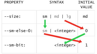
Every first couple of steps in CSS Type Grinding is passing your input into another variable whose type is a subset of the input’s syntax + an initial-value that corresponds to the values you omitted in your subset. For example, the chart below shows a user input of sm being assigned to our --size variable and grinding into only 0 or 1.
That’s a mouthful in English and if the chart didn’t help yet, let’s continue with the next example and find clarity in code:
@property --position {
  syntax: "left|top|right|bottom";
  initial-value: left;
  inherits: true;
}
That’s your user input. you need to grind it into display values for your ::before pseudo following the rules below:
--position -> --_display-before
left -> inline-block
top -> block
right -> none
bottom -> none
We can’t jump straight to --_display-before, so let's pick your none value first:
@property --_pos-to-before-step1 {
  syntax: "left|top|none";
  initial-value: none;
  inherits: true;
}
As you laid out previously, right and bottom should become none, so you’ve omitted them from your subset and added none to what’s allowed.
.type-grinding {
  --position: top;
  --_pos-to-before-step1: var(--position);
}
--position: top; results in var(--_pos-to-before-step1) returning top because --_pos-to-before-step1 is allowed to be left|top|none.
You never know what users will try, --position: 99 foobars; results in var(--_pos-to-before-step1) returning left because --position rejected it and returned its initial-value of left, which is valid for --_pos-to-before-step1 since it's allowed to be left|top|none.
--position: right; is accepted for position, but it results in var(--_pos-to-before-step1) returning none because right is invalid here and it uses its initial-value of none
--position: bottom; results in var(--_pos-to-before-step1) returning none.
Next, let’s chain this into another grind and take care of --position: top; becoming block:
@property --_pos-to-before-step2 {
  syntax: "left|block|none";
  initial-value: block;
  inherits: true;
}

.type-grinding {
  --position: top;
  --_pos-to-before-step1: var(--position);
  --_pos-to-before-step2: var(--_pos-to-before-step1);
}
Our --_pos-to-before-step2 variable now accepts two different display values, block and none, plus a subset of the previous step (left).
If step1 was none, step2 is still none.
If step1 was top, step2 is now block.
If step1 was left, step2 is still left.
All that’s left is left so let’s call it --_display-before instead of step3:
@property --_display-before {
  syntax: "inline-block|block|none";
  initial-value: inline-block;
  inherits: true;
}

.type-grinding {
  --position: top;
  --_pos-to-before-step1: var(--position);
  --_pos-to-before-step2: var(--_pos-to-before-step1);
  --_display-before: var(--_pos-to-before-step2);
}
--position -> --_display-before
left -> inline-block
top -> block
right -> none
bottom -> none
foobar -/> (left) -> inline-block
7.2 -/> (left) -> inline-block
And you’re done with that transformation!
Doing the same for ::after, using the same --position var as input, you want to see these results:
--position -> --_display-after
left -> none
top -> none
right -> inline-block
bottom -> block
foobar -/> (left) -> none
7.2 -/> (left) -> none
The implementation is a perfect exercise if you wish to practice, so I’ll leave it here for you!
The badge demo at the top of this article, in addition to splitting it into ::before and ::after display buckets, also splits --position into individual 0-or-1 bits for each top, left, etc like you did previously for the size vars.
That also makes for a perfect exercise since you’ve already established the pattern, so again I’ll leave that here for you!
Those bits are super useful though and will allow you to change numeric, length, and percent values on any property you want... but that requires a bit of calc()ing to reassemble the ground bit data into specific values. Let’s continue to see how that works!
5. CSS Type Grinding - Calc()ing Your Bits into the Array-Like Indexed-Value Trick
As a reminder, these variables contain single-bit values (0 or 1) based on if --size was set to the corresponding value:
--_if-sm-then-1-else-0 --_if-md-then-1-else-0 --_if-lg-then-1-else-0
Let’s say if size is font, then you want a single variable that combines your bits into this chart:
--size -> --_font-size
sm -> 0.75rem
md -> 1rem
lg -> 1.25rem
Here’s the math you need to know to accomplish this:
1 times X = X
0 times X = 0
0 plus Y = Y
We already know each of your bits is always either 0 or 1 and you also know that only one of them can be set to 1 at a time. Further, you know invalid sizes result in --size computing to md, which means the md bit will be 1 and the others will be 0 in that case.
That means if you add all of your bits together, you always get 1. No matter what.
So then all you have to do is multiply your bit (0 or 1) with its corresponding desired value from the chart, and add those values together. Only one of them will be a value, the rest will be 0, adding 0 does nothing, so you effectively have an indexable array of values in a single calc()!
Here’s what it looks like:
.type-grinding {
  /* ... previous code here ... */

  --_font-size: calc(
    var(--_if-sm-then-1-else-0) * 0.75rem +
    var(--_if-md-then-1-else-0) * 1rem +
    var(--_if-lg-then-1-else-0) * 1.25rem
  );
}
That’s it! your table is satisfied. If --size was lg then --_font-size is 1.25rem, etc!
We can use your bits again to calculate another property, let’s say padding:
.type-grinding {
  --_padding: calc(
    var(--_if-sm-then-1-else-0) * 4px +
    var(--_if-md-then-1-else-0) * 8px +
    var(--_if-lg-then-1-else-0) * 12px
  );
}
We can reuse the bits any number of times for any number-based CSS value you want!
Our bits can do much, much, more too. Like using them to alter hsl() color values individually! Take a look at Ana Tudor’s Dry State Switching article on CSS Tricks for an abundance of bit magic.
But wait—there’s so much potential here for your dev-users to have an even better API!
What if you take your internal calc()s for font and padding sizes and use variables for the values instead? Then dev-users can override the meaning of sm, md, and lg for any of your properties you allow them to! They could override them globally, on a specific instance, or on any pattern or grouping of instances based on whatever CSS selector they use to target the overrides.
Here’s what it looks like:
.type-grinding {
  --font-sm: 0.75rem;
  --font-md: 1rem;
  --font-lg: 1.25rem;

  --_font-size: calc(
    var(--_if-sm-then-1-else-0) * var(--font-sm) +
    var(--_if-md-then-1-else-0) * var(--font-md) +
    var(--_if-lg-then-1-else-0) * var(--font-lg)
  );

  --pad-sm: 4px;
  --pad-md: 8px;
  --pad-lg: 12px;

  --_padding: calc(
    var(--_if-sm-then-1-else-0) * var(--pad-sm) +
    var(--_if-md-then-1-else-0) * var(--pad-md) +
    var(--_if-lg-then-1-else-0) * var(--pad-lg)
  );
}
Now your CSS API has options to specify each of the meanings if your dev user wants to customize it! AWESOME!
So far you’ve converted arbitrary custom-ident keywords into other keywords and into bits (which enables lengths, percentages, other numbers, and all colors via individual components of hsl() / rgb() / etc.)...
But is there an easier way to cycle color variants directly instead of using bits to build individual hsl or rgb components? Yep! And it enables all other CSS types too, even Space Toggles if you need!
6. CSS Type Grinding - Arbitrary Type Casting with an Animation Trick
For our last trick, you’re going to rely on everything you’ve done previously and satisfy the following mappings:
--variant -> background
primary -> rebeccapurple
secondary -> violet
success -> lime
error -> red
--variant -> color
primary -> white
secondary -> black
success -> black
error -> white
In order to do this, you’re going to split --variant into individual bits for each option, then create a combined calc() from those that sets a specific animation property, and the animation will set your bg and color.
We’ve done all of this a couple of times now, up until the new calc() requirements. So let’s just get that out of the way in full:
This time your variant bits are in these variables:
--_v-primary-bit --_v-secondary-bit --_v-success-bit --_v-error-bit
In order to tackle this challenge, I came across an article on CSS Tricks by Chris Coyier: Starting CSS Animations Mid-Way
The article sheds light on an avenue to accessing specific keyframes of an animation by using a negative animation delay—which is something you could set with a calc()!
So all you have to do is leave an animation paused so it’s not burning CPU and specify which frame you want to remain paused on with your calc().
Also, you need to use step-end as the timing function so the animation isn’t interpolating/blending values between keyframes. This allows one specific value to occupy the entire keyframe and instantly switch to the next keyframe’s value at the time/percent boundary.
Keyframes are specified by %, which is a percentage of the animation duration, then your delay is relative to both in order to target your keyframe. So to make the math easier, let’s say the duration is 100ms and your keyframes are at every 10%. Then your animation delay should be -5ms to be square in the middle of the first keyframe, -15ms to be square in the middle of the second, etc.
That means with this pattern you could have up to 10 variants in the keyframes following the pattern, but you’re only using 4 and can ignore the rest. Let’s test!
Great! Let’s build the calc() to set that --_paused-position variable from your variant bits! It starts with -5ms and subtracts 10ms each frame:
--_paused-position: calc(
  -5ms
  - var(--_v-primary-bit) * 0ms
  - var(--_v-secondary-bit) * 10ms
  - var(--_v-success-bit) * 20ms
  - var(--_v-error-bit) * 30ms
);
That should do it! Before you bring it all together and play, let’s do one last major upgrade like the one you did with the sizes before; you can specify variables as the values at each keyframe instead of fixed values! That means your dev-users can override your default values the same way they override your size defaults:
@keyframes typeGrinding {
  /* -5ms of 100ms :: primary */
  0% {
    color: var(--primary-color);
    background: var(--primary-bg);
  }

  /* -15ms of 100ms :: secondary */
  10% {
    color: var(--secondary-color);
    background: var(--secondary-bg);
  }

  /* -25ms of 100ms :: success */
  20% {
    color: var(--success-color);
    background: var(--success-bg);
  }

  /* -35ms of 100ms :: error */
  30% {
    color: var(--error-color);
    background: var(--error-bg);
  }
}

.type-grinding {
  --primary-bg: rebeccapurple;
  --primary-color: white;

  --secondary-bg: violet;
  --secondary-color: black;

  --success-bg: lime;
  --success-color: black;

  --error-bg: red;
  --error-color: white;
}
EXCELLENT! Let’s play:
That's it! Have fun!
Think this trick is neat? Have any ideas? Have any questions? Let me know! 👽💜
Like Our Style?
Bitovi has experienced React consultants ready to hit the ground running to support your project. Schedule your free consultation call to learn more!
PS: Should you do this?
You likely don't need to do something like this with a CSS-only approach—but now you can and I'm definitely in favor of it! Especially once @property hits other browsers.
I have a lot of fun focusing on CSS-only approaches just to test what's possible and discover interesting ideas that may influence the direction CSS takes. Like most programmatic CSS tricks I've come up with or written about, this may feel like another "hack" because writing it is beyond normal/daily CSS.
Arguments against it may be that if it's difficult for the authors to read and write, then it's more challenging to maintain or iterate on, so "just use js".
It's not too difficult once you get used to the patterns though, and the dev-user API it enables feels great.
If you don't mind or are already using a build system with PostCSS though, definitely check out Token CSS because keyword-based CSS APIs similar to what we're building here (not CSS-in-JS) are, again, a great developer-user experience.
PPS: Thank you for asking, Joe!
I woke up at 2am, saw this question on my phone, then rolled over to fall back asleep.
While doing everything in my power to stop thinking and sleep though, I realized how we might be able to do it. Naturally, I sprung out of bed to test it because it would be awesome if it worked—and it did! I stayed up all night hashing out the details, started writing the css-badge demo component, and started writing this post!
Thank you Joe! :)
 css
css