


.svg)


Establishing a Design System improves the quality of a product for the people creating and maintaining it and offers the end-user a better experience. While building a Design System prior to creating a product is the best approach, you may find yourself in the position of having to create one retroactively. Instead of having made documented design decisions prior to development, you have to identify existing patterns and consider how best to standardize them.
Read on to find out what Design Systems are and how they add value to your workflow. You'll learn a 3-step process for analyzing existing products to create a Design System. Finally, I walk you through an example of breaking down an existing product into basic design elements. When you're done, you'll know how to think about product elements in terms of a Design System and be able to build one.
What is a Design System?
A Design System is a system of reusable components, patterns, and guidelines. It represents a clearly defined set of standards to serve as a single source of truth for collaboratively constructing products.
What does a Design System Include?
Design Systems can include several different elements. Some common examples are:
- UI Components (buttons, form fields, etc.)
- User Experience Guidelines (interactivity)
- Design Elements (colors, typography, spacing, etc.)
- Branding (logos, icons, language)
- Style Guides and Documentation (visual specs, processes, common language)
Why Create a Design System?
A Design System helps connect and improve the workflow of the team members involved in the creation of products by:
-
Defining systems and guidelines towards which team members adhere
-
Establishing common, consistent language to facilitate communication across disciplines
-
Providing a single source of truth for visual verification
-
Reducing repetitive CSS/component development work done by application developers.
A sound Design System increases the quality, coherence, and consistency of products, resulting in a better user experience.
How to Think about Design Systems
Conceptualizing a Design System has three phases:
-
Identification
-
Standardization
-
Documentation
Here’s a brief overview of each phase. You’ll see specific examples in the walkthrough.
Identification Phase
In the identification phase, you identify common visual elements your application uses. Elements include design elements, such as typography, general page layout, icons, color schemes, and user interface components such as buttons and navigation bars.
The identification phase aims to develop an inventory of items to consider when building your Design System. Whether or not a particular item gets included in the result will be determined later.
Standardization Phase
During standardization, you review the identified items and start defining potential design tokens (more about these later!), styles, and component variations and states. Consideration should be given to any one-off use cases of components or design elements. Any redundancies or inconsistencies in the items should be examined and reduced where possible.
The goal of standardization is to elaborate on the items identified in the first phase and prepare for creating documentation in the next phase while eliminating any unneeded variations to increase overall consistency.
Documentation Phase
The documentation phase is where you finalize the specifications for your Design System's components and elements. Using the information gathered in the previous phases, you build a style guide to serve as the source of truth for implementing the components and design elements within your Design System.
In a real-world scenario, your documentation will likely use a tool such as Storybook to allow you to keep your Style Guide and usage guidelines in sync with interactive references for your actual component implementation.
Documentation forms the core of a Design System. The ultimate goal of the documentation phase is to produce a Style Guide to serve as a single source of truth. Having a single source of truth is essential so designers, developers, and consumers have something reliable to perform validation against.
Walkthrough of How to Build a Design System
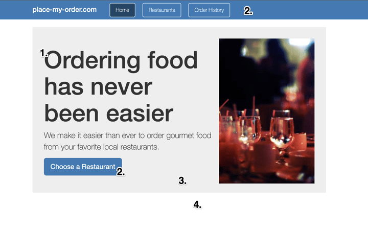
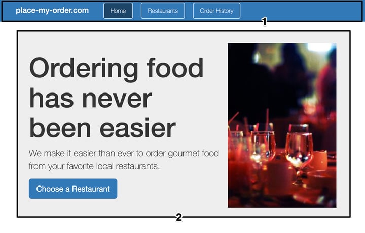
For my example, I'll use the homepage of the PlaceMyOrder app described in Bitovi Academy’s Learn Angular lesson. You can see a live version at place-my-order.com.
Identification Phase Example
Get started by identifying the design elements present on the PlaceMyOrder homepage.
Colors
The homepage of the PlaceMyOrder app uses four main colors:
-
Body Text -
#333 -
Button and Nav Background -
#337ab7 -
Accent Area Background -
#eee -
Page Background -
#fff
You’ll examine colors more closely in the standardization phase. For now, make note of these four colors and move on.
Typography
The page-level text on the homepage includes headers and body text. The navigation header and accent content areas contain text using h1 tags, and the accent content area contains body text within a p tag.

Though buttons also contain text, you should look at them as individual components rather than page-level typography. (Components typically inherit typographic styling from page level or use text styling specific to the components themselves.)
Containers / Layout
You can identify two containers on the homepage:
-
Navigation header container
-
Body accent area container
The navigation header container spans the full width of the page, while the body accent area container has a fixed width and is horizontally centered.
Components
The homepage has two components:
-
Button
-
Navigation bar
The button is a standard UI button that can be used as a native button element, or as is the case on the homepage, as an anchor tag.
The navigation bar consists of a row of anchors decorated as outlined buttons and lives within the navigation header container. At first glance, these buttons appear similar to the stand-alone button component, so they will be a good candidate for scrutiny when you reach the next phase.
Standardization Phase Example
Now you've identified the basic elements of the PlaceMyOrder home page. You can start analyzing them.
Design Tokens
First, define some design tokens representing values that repeatedly occur throughout your system. (For a deeper dive into design tokens, check out this article). For my example, the values fall into three categories: typography, color, or size/layout.
Design Tokens are named tokens that store visual design attributes such as colors, fonts, and spacing, allowing these values to be applied across designs and implementations and utilized by tooling.
Throughout my walkthrough, I used YAML-style pseudo for defining tokens for presentational convenience. In practice, tokens could be expressed as custom CSS props, SASS variables, or JSON combined with custom tooling.
Color
The four main homepage colors from the identification phase are:
-
Body Text -
#333 -
Button and Nav Background -
#337ab7 -
Accent Area Background -
#eee -
Page Background -
#fff
In addition to the dark body text color, you also need to consider the lighter text color seen on buttons. It has the same value as the page background, #fff. Using a single design token makes sense in some cases, such as the navigation bar and button sharing a background color. However, I treat it as a fifth color because contrast is essential for text color on a dark background.
When deciding whether you should create separate tokens for a single value used in multiple ways, consider whether there will ever be a case where you'll want different values to be used. A value is used in two locations doesn’t mean both should refer to a single token. For example, using a single token to represent the page background color and button text color (both white) doesn’t make sense, as they aren’t contextually linked.
I can express the tokens something like this:
# Typography Colors

text:

  # Text on a light background

  base: #333

  # Text on dark backgrounds (like buttons)

  light: #fff

  # Use primary color for link text

  link: $primary

# Content Colors

content-background:

  # base background, for page level

  base: #fff

  # accent area background

  accent: #eee

# 'primary' theme color - used by buttons

primary: #337ab7
Keeping your token names descriptive of how they will be used rather than of their actual values will make it easier to maintain in the long run. Calling primary blue might make sense now, but what if you want to have maroon buttons in the future?
I've grouped the page background and accent colors under content-background. This grouping clarifies that these values are intended for backgrounds while leaving them available for use on different types of elements.
Because the primary color will be used for button elements, the primary token seems like a perfect place to define the various state colors buttons will pull from.
Since I've updated the primary token, I need to update the link text color token. I've gone ahead and added a token for the link hover state, which references the primary-hover token:
# Typography Colors

text:

  # Text on a light background

  base: #333

  # Text on dark backgrounds (like buttons)

  light: #fff

  # Use primary color for link text

  link: $primary-base

  # Use primary-hover for link text hover color

  link-hover: $primary-hover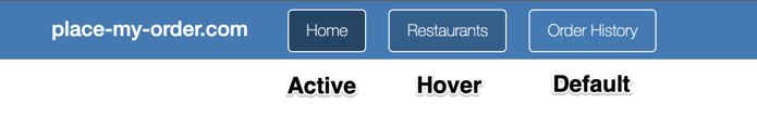
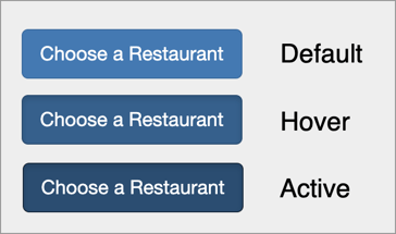
The button has three primary states, as seen in the above picture. After adding them to the tokens, the primary Token looks like this:
primary:

  # base / idle primary color

  base: #337ab7

  # hover state

  hover: #286090

  # active state

  active: #1d4568
While inspecting the button elements to find color values, I noticed that the active state color used by the buttons in the navigation bar and within the page body are slightly different. Both button use cases have the same neutral and hover state colors, which is a discrepancy. To reduce complexity, I've chosen to assign the value used by the navigation bar button to the active Token.
Typography
The most obvious candidate for tokenizing when it comes to typography is font. The PlaceMyOrder app uses a single font throughout. Using design tokens for projects where multiple fonts are used, rather than a single root-level font, becomes more important for maintainability.
# Font family

font: "Helvetica Neue", Helvetica, Arial, sans-serif
When it comes to tokenizing font sizes and styles, it is worth considering how likely these values are to be shared by multiple elements, and how likely those elements are to be changed in the future.
For base typography, such as headings and paragraphs, it can be beneficial to create tokens. One-offs and special cases, such as the larger p body content that appears within the accent box on the PlaceMyOrder homepage, might make more sense to capture as static styles. These styles can derive their value from calculations involving the base tokens, so you still maintain some flexibility.
At a minimum, tokenize the base font size for your page. This can then be used as a reference for other tokens or directly in styles down the line.
# Font sizes

font-size:

  # Base used for body

  base: 14px

  # Medium size

  medium: 21px


# Header level 1

h1:

  font-size: 36px

  margin: 20px 0 10px 0

# Header level 2

h2:

  font-size: 20px

  margin: 40px 0 20px 0
As you can see, I've defined a base and medium font size for general typography. I've also explicitly called out the size and margin values for header levels 1 and 2. In a real world scenario, you'll likely want to cover additional header levels and things like labels.
Sizes / Layout
The last group of items I'll cover tokenizing is size and layout. This can cover both explicit sizes used by components and visual elements, as well as general purpose spacers and page level break points.
For the purposes of this example, I'll specify a base spacer size of 6px. Ideally, this means that general container padding and margins will utilize sizes that are multiples of 6px. The navigation header, for example, is 7 spacers tall (42px).
# base spacer size

base-spacer: 6px

# Navigation header

nav:

  height: 7 * $base-spacer
Typography
Now that I've got some typography design tokens identified, I can flesh out what the core typographic styles will look like. This is important preparation for the documentation phase, and an opportunity to establish the rules for styling common typographic elements.
In the SCSS code below, I've made use of the design tokens defined previously to draft out the styling for level 1 and level 2 heading tags. Since only a single font is being used, I've referenced it on the body element rather than on each individual header tag.
Note that the line-height rule for each of the headers is derived directly from the font size tokens. Using calculations to derive values from other tokens can be powerful, and reduce the complexity of the tokens you need to explicitly define and maintain. If more specific values end up being needed at a later time, literal values can be used, or additional design tokens can be defined.
body {

	font-family: $font;

}


// Level 1 Heading

h1 {

	font-size: $h1-font-size;

	margin: $h1-margin;
	line-height: $h1-font-size * 1.4;

}


// Level 2 Heading

h2 {

	font-size: $h2-font-size;

	margin: $h2-margin;

	line-height: $h2-font-size * 1.4;

}
Two paragraph elements were identified in the identification phase The SCSS code below shows use of the two font-size tokens to define these p element styles.
p {

	font-size: $font-size-base;

}


p.medium {

	font-size: $font-size-medium;

}- Lists
- Captions
- Definitions
- Labels
Consideration should also be given for special cases and decorations that are used enough to constitute patterns. These can be built out using helper style classes. (The medium paragraph size class shown above is a very basic example of this.)
Containers
The PlaceMyOrder homepage only has two containers- the navigation header, and the accent area box. I've captured styles for both below, making use of the tokens identified earlier in the phase.
This SCSS snippet also sets the page background color, since it could be argued that the page itself is a container.
body {

	// Set page background color

	background-color: $content-background-base;

}


// Navigation bar container

nav {

	background-color: $primary-base;

	color: $text-light;

	height: $nav-height;

	padding: $base-spacer;

}


// Accent container

.accent-area {

	background-color: $content-background-accent;

	// Padding derived from base spacer unit

	padding: $base-spacer * 5;

}
Components
- Variations
- States
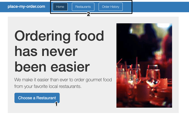
The main component featured on the PlaceMyOrder homepage is a button. I identified three states for buttons when I captured the color design tokens: default, active, and hover.
Comparing the appearance of the button within the body of the page to those that show up in the navigation header, you can see a potential variation. The button within the navigation header has a white outline.
Variation in this context refers to a high level variant of a component. Variations should include a visual aspect, but might also alter behavior in a broad sense.
As you come across variations while standardizing a component, ask yourself the following:
- Should this single component support multiple variations?
- Are the variations purely visual, or do they include functional differences?
Deciding whether or not a component should support multiple variations depends on the variations themselves, and on how you plan to eventually implement them. Generally, if a variation has functional differences, or is drastically different visually from other variations, it is probably a good idea to consider breaking that variation out into its own component.
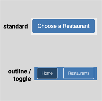
In the case of the button, the navigation header variety has both a minor visual difference (the white outline), and a functional one (it maintains a toggle state).
Documentation Phase Walkthrough
Now that you've identified and refined the elements you are including in your Design System, it is time to capture that information in the form of formal documentation.
For the purposes of this post, I'll give examples of what Style Guides might look like for three main areas: Color, Typography, and the Button component. In a real world System, your documentation should cover the entirety of your product.
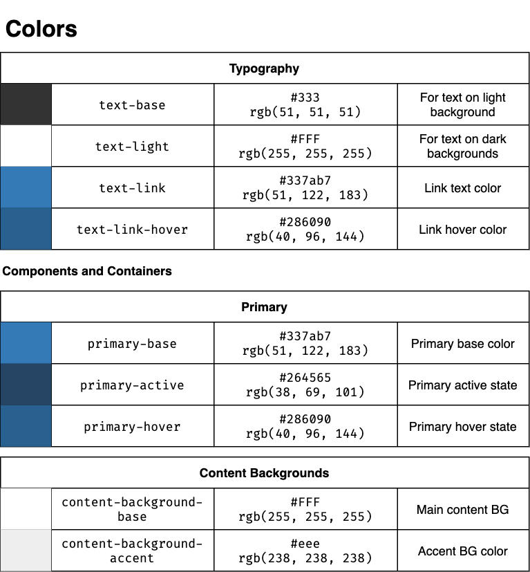
Colors
I've documented the color design tokens previously identified in the style guide below. The colors are grouped into tables based on use.
Each row consists of a color value preview, a canonical name for the color based on its design token, and the color value. A short summary of the purpose of each color is also included.
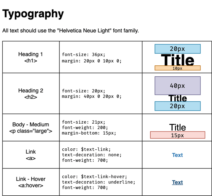
Typography
For the typography guide, each item includes a descriptive name paired with the appropriate semantic HTML element to use. The applicable style properties are called out, referencing design tokens for color values where appropriate. Additionally, a visual example each style is given, along with guides representing margin placement.
I've also mentioned that "Helvetica Neue Light" should be used for all text, rather than explicitly including it in the property list for each individual style.
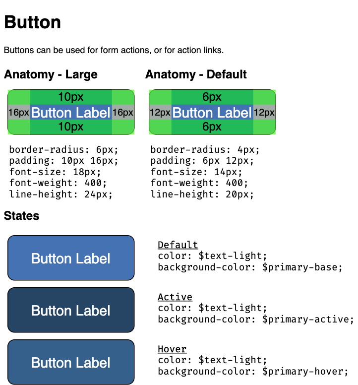
Components
A component style guide should cover the component’s anatomy and base styling. It should also document supported states and interactions.
The example style guide for the button component below shows the anatomy of both default and large size variations. For convenience, it includes visual padding references in the visual examples. The base styling for each size variation is also called out in the form of CSS code. For the three interaction states, variable names are used in place of literal color values.
Conclusion
I’ve introduced and shown you how to follow the three step process of identification, standardization, and documentation to break down an existing page and produce simple style guides for an existing page. Now that you’ve got an idea of how to think about Design Systems, you should be better equipped to start identifying how developing one can improve the products you work on.
Design Systems offer huge benefits for Enterprise-level companies, but can be overwhelming to start building. Bitovi can help - schedule a free consultation with our team of expert engineers to find out how we can help you lay the groundwork to build and maintain your own Design System.
 ui
ui