


.svg)


Good developers and managers understand the concept of extensibility: implementing while considering future growth.
Developers are building cutting-edge applications with powerful web components every day. But these components are of limited value if they can’t be reused across projects.
Wouldn’t it be great if reusing your web components was just… easy?
Spoiler alert: it is! This post will provide five easy steps to follow to build reusable web components that are flexible enough to work with any module loader, fully unit-tested, and well documented.
And at Bitovi, we believe in open-source, so as a bonus, you’ll learn some tricks for open-sourcing your component.
Let’s Get Started!
So what are the steps? Easy!
Follow Along
bit-c3 will be used as an example web component for each of these. While it is written in CanJS, the concepts being discussed can be applied to any web component.
You'll recognize bit-c3 from our recent article on Custom HTML Architecture, where Brian showed us how to quickly generate a graph using HTML components:
Using a component like bit-c3 in your CanJS application is easy:
npm install bit-c3 --save
Then load it up through your favorite module loader.
Step 1: Organize
You can have the greatest component in the world, but if it’s not organized so others can understand it, what’s the point? By having a common, consistent structure, naming scheme, and project organization, you’ll be able grow your library quicker and easier than ever.
There are two ways you can organize your components into a library. We’ll walk through the tradeoffs for each.
All Components in One Project
By having all your components in one project, you only have to include and configure once. There is less boilerplate, with only one test runner, one documentation manager, one build script, and one release process.
If you organize your components in one project, you can use the following structure to organize:
/docs
/src
  /componentA
    componentA.js           // component definition
    componentA_viewModel.js // ViewModel
    componentA_test.js      // unit tests
    componentA.html         // component example
/test
  test.js                   // includes component unit tests
  test.html                 // test runner
package.json
README.md
Each Component in its Own Project
There are significant benefits to having each component in its own project:
- You are only installing the components you need, which can reduce file size and improve load time.
- Tests, documentation, and examples can be easier to find.
- It’s much easier to open-source individual components.
- Releases can be much simpler
- It allows users to upgrade a single component quicker without affecting their other components.
If you are considering open-sourcing your component, moving your component to a separate project is a good first step. You can use the following structure to organize your project:
/docs
/examples
  component.html // component example
/src
  component.js   // component definition
  viewModel.js   // ViewModel
/test
  component.js   // unit tests
  test.html      // test runner
package.json
README.md
For this article, the examples will assume you’ll be taking the latter approach to organizing your project. But both structures will put you in a great position to grow your component library quickly and easily!
Step 2: Build and Test
There are many great resources available for teaching you how to build custom components (our article on custom HTML element architecture is a great start). As you’re building your components, the following strategies can help you build more extensible (and testable) components.
Split Component and ViewModel
Separating your viewModel and your component into separate files makes each file easier to read, and makes your component more testable. A standard component might look like this:
import can from "can";
import 'can/map/define/';

can.Component.extend({
  tag: "bit-c3-data-column",
  viewModel: {
    define: {
      chart: {
        type: '*',
        value: null
      },
      valueSerialized: {
        get: function(val) {
          return this.attr('value') && this.attr('value').serialize();
        }
      }
    },
    'value': null,
    'key': null
  },
  events: { … }
});
But this is very hard to test without including the component, and extracting the viewModel from it. Instead, a few simple tweaks can make testing much easier:
column.js
import can from "can";
import ColumnVM from './viewmodel';

can.Component.extend({
  tag: "bit-c3-data-column",
  viewModel: ColumnVM,
  events: { … }
});

export default ColumnVM;
viewmodel.js
export default can.Map.extend({
  define: {
    chart: {
      type: '*',
      value: null
    },
    valueSerialized: {
      get: function(val) {
        return this.attr('value') && this.attr('value').serialize();
      }
    }
  },
  'value': null,
  'key': null
});
Now it is clearer which pieces are using which imports, and since the bulk of the testable functionality is in viewmodel.js, we can simply include that when testing, instead of the entire component (“Huh!?!?” - don’t worry, testing examples are below).
Modularize as Much As Possible
In addition to splitting your component and viewModel, components with sub-components should be split into separate files and folders for easier organization. Bit-c3 is a complex component with parent (bit-c3) and nested subcomponents (bit-c3-data, bit-c3-data-column, etc.). Instead of putting these sub-components in one huge file, we can split the structure up as follows:
/src
  /data
    /column
      column.js
      viewmodel.js
    data.js
    viewmodel.js
  bit-c3.js
  chart.js
  viewmodel.js
You may be wondering why there is both a bit-c3.js and a charts.js file? Let’s look inside both files:
bit-c3.js
import './bit-c3.less!';
import './chart';
import './data/data';
import './data/column/column';
import './data/group/group';
import './data/name/name';
import './data/type/type';
import './y-grid/y-grid';
import './y-grid/y-grid-line/y-grid-line';
chart.js
import can from "can";
import d3 from "d3";
import c3 from "c3";
import template from "./chart.stache!";
import ChartVM from './viewmodel';

can.Component.extend({
  tag: "bit-c3",
  template: template,
  viewModel: ChartVM,
  events: { … }
});

export default ChartVM;
Bit-c3.js is a superset of chart.js; that is, if a developer wants all of the bit-c3 functionality on one package, they can just include the whole library, and presto: they’ve got it!
// Add Bit-C3 to application
include "bit-c3/"
But not everyone may want or need all of bit-c3. For example, at Bitovi, we worked with gThrive, who was building a mobile web application designed to function in low bandwidth environments. With the gThrive app, every unnecessary byte their users had to download meant less time using their app.
gThrive wanted to add a simple line graph to their app, but didn’t need data groups, named columns, or grid lines. For their app, we simply changed our includes:
// Add Bit-C3 charts and columns
include "bit-c3/chart";
include "bit-c3/data/";
include "bit-c3/data/column/";
Modularizing your component is a small change with huge benefits. Splitting these files makes the project more extensible and gives developers total flexibility on how they use it.
Focus on Test Coverage
With good tests, other developers will be able to enhance your component without fear of breaking existing functionality. By modularizing your component and separating your viewModels, your components become extra easy to test.
Using Bit-C3 as an example, if we didn’t separate our viewModels and modularize the component, our unit test file would be unwieldy.
Instead, our test file becomes easy to read and our tests are much easier to implement:
// unit testing framework
import QUnit from "steal-qunit";
import F from "funcunit";

// modules to be tested
import ChartVM from "bit-c3/chart";
import DataVM from "bit-c3/data/";
import ColumnVM from "bit-c3/data/column/";

// hook up Funcunit to QUnit
F.attach(QUnit);

// test each module
QUnit.module('bit-c3');
test(“test bit-c3 viewModel attribute set correctly”, function() {
  var vm = new ChartVM({ foo: “bar” });
  ok(vm.attr(‘foo’), ‘bar’);
});
There are many great options for unit testing in Javascript, and using CanJS and StealJS, it’s even easier! To start, StealJS makes it easy to get up and running with QUnit, Jasmine, and Mocha add-ons. You can level-up your unit tests even further by using Funcunit to simulate user actions and easily test asynchronous behavior, and Testee to automatically run your tests from the command line in any browser.
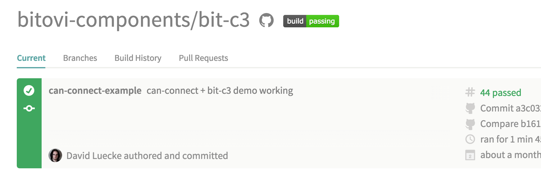
The full Bit-C3 tests are available on GitHub, and run with every build in Travis, our CI environment.
Step 3: Demonstrate
Build out examples and demos of your component. These are standalone, static HTML pages that quickly show your component in action and suggested ways of using it. Building demos helps you and developers using your component.
Integration Testing Made Easy
A demo page lets you tweak your styles, and make sure things are working as you expect them to. Often when developing new features, it’s easier to build in a sandboxed environment than inside a larger app. This way you can also use fixtures (mock service responses) or sample data for things like load testing or edge case testing.
Strut Your Stuff
Example pages like in the image below let other developers or template composers know how to use your component in the most common cases.
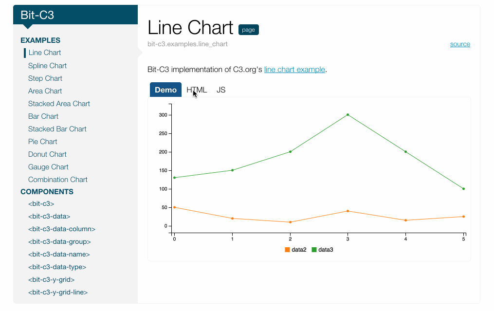
Bit-c3 offers a ton of configuration options, and could be confusing for a first-time user. Instead, code examples make it easy to get started.
"I want a line graph!"
"How do I build a pie chart?"
"What about a complex graph with stacked bars and areas?"
Sweet! Now How Do I Do That?
A typical example is very simple, especially using the latest CanJS and StealJS. Let's take a second look at Brian's example from earlier:
For only a few lines of code, there’s a lot being demonstrated! You can put this, and any other examples of your component in action, in your /examples directory (see bit-c3 for a reference). Not only will these be easy to find in the file structure, but as you’ll see in the Document section, you can easily include these live examples inside your documentation!
Step 4: Document
Next, document your component. Make sure your code, READMEs, and how-to guides are up-to-date and complete.
At Bitovi, we recommend the excellent DocumentJS library to build your documentation. There are several guides available to make documenting your component quick and easy. And with DocumentJS, your docs don’t have to be limited to code blocks; you can include guides, usage examples and demos as well!
Speaking of demos… remember those examples you made earlier?
^Ya, that one. DocumentJS makes it easy to integrate those examples using the @demo tag. This example shows a Bit-C3 line chart with live-bound data. A developer or template composer can quickly figure out how to build their own line chart by looking at the HTML, Javascript, and a final product.
Step 5: Release
By this stage, you have a fully functioning, tested, demoed, and documented component. That’s awesome! Give yourself a pat on the back! Sharing your component is now incredibly easy.
Version It
Make sure you are versioning your project (possibly following the Semantic Versioning guidelines). Include versioning guidelines in your project’s README, along with contribution guidelines if you are open-sourcing (here are Bit-C3’s, as an example).
Export It
Developers load web components in different ways, from using a module loader like StealJS or RequireJS, to directly imbedding the scripts on the page. To give your component's users maximum flexibility, consider using steal-export to build your project in several common formats on the web (ES6, CJS, AMD, etc.). Use this simple Grunt config for steal-export.
var config = {
  'steal-export': {
    dist: {
      system: {
        config: 'package.json!npm'
      },
      outputs: {
        '+cjs': {},
        '+amd': {},
        '+global-js': {},
        '+global-css': {}
      }
    }
  }
}
Your component can now be easily used with StealJS:
import "bit-c3";Or RequireJS:
require("bit-c3");Or directly imbedded:
<script src='./node_modules/bit-c3/dist/global/bit-c3.js'></script>Publish details in your README or documentation about how to use your components in each of these formats to maximize your exposure. Check out Bit-C3’s README for an example.
Use It
Typically, using a component is as simple as adding a dependency in your package.json or bower.json, pointing to your project repository and version tag:
dependencies: {

  “bit-c3”: “https://github.com/bitovi-components/bit-c3#0.0.5”

}
Share It
Share, Tweet, or blog about your accomplishment. Not only will you get great feedback about your component, but sharing will improve your (company’s) exposure and build a community around your component library.
C3 custom elements for CanJS: http://t.co/QBe1GP01uJ by @MrKyleGifford !
— Justin Meyer (@justinbmeyer)
Release It
Here are some additional resources you can look into, especially if you want to open source:
- Publish your package on NPM and/or Bower.
- Quickly add Continuous Integration with Travis CI or Codeship.
- Host your documentation on Github Pages or Heroku.
- Build a community around your component with Gitter.
What other resources would you recommend? Please leave your favorite services in the comments to help others improve the value of their components!
Do you have a success story or lessons you learned building reusable components? Share them in the comments below!
 open source
 Previous Post