


.svg)


Incorporating white space into your UI design gives users a break from visual overload and makes their experience more relaxed and enjoyable. Reducing visual load helps increase task completion rates and keeps your users coming back for more.
So, let's dive into the world of white space and learn how you can make it work for you and your users!
Human Psychology
First, let’s look at a few aspects of how the mind processes information. It’s crucial for product designers to understand psychology. UI design revolves around creating interfaces that are intuitive. By having a solid understanding of how the human mind works, designers can craft interfaces that are not only visually appealing but also psychologically effective.
Multitasking
The ability to focus on more than one thing at a time is called multitasking. The idea of multitasking can be mistaken as a good thing. The ability to maximize your time by working on two or three tasks at once is praised in some circles.
But here’s the thing about multitasking— it’s fake. The human brain is not actually capable of handling more than one major task at a time. According to the American Psychological Association, the brief mental blocks created by shifting between tasks can cost up to 40% of someone’s productive time.1
Meditation
There are various forms of meditation, but letting go of one’s thoughts is always a key part of the process. By doing this you are removing the tangled mess in your mind and focusing.
Harvard University researchers have found that our minds are lost in thought about 47% of the time.2 However, researchers at Columbia University Medical Center claim meditating can change the structure and function of the brain through relaxation, which can increase focus.2
The key takeaway here is that our minds perform better with less clutter.
Overcrowding
It may seem smart to include all the features and information and have all of the ways to complete a task all in one place. But sometimes, good intentions run awry, filling the screen with too many elements that end up crowded together.
Overcrowding makes it difficult to focus on one thing at a time. Instead of allowing users to do everything, the cluttered screen keeps users from doing anything. So how do you avoid overcrowding and create a successful UI?
Customer Research
Instead of guessing which features your user might want, ask them! This way, you can remove any features users don’t care about, low-priority features, or features that have a poor return on investment. By narrowing down the most important features, you immediately remove a lot of unnecessary clutter from your entire product.
Information Architecture
You don’t have to show everything, everywhere, all at once. Organize your content and divide it into menus leading to multiple pages that are intuitively connected. This way, your users can digest the information easier, and they don’t have to see details they’re not interested in.
User Interface Testing
Test multiple ways for someone to do important tasks instead of just having multiple ways for someone to do them. By testing, not only can you see which version works best, but you can also see how to make that version even better. This will clear up confusion and improve your product experience.

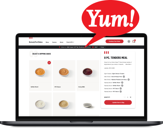
| Notice how the UI on the right is less overwhelming? The white space reduces visual load. |
White Space
Giving breathing room to each element on the screen creates a relaxing and pleasant environment, allows users to focus on what’s important, and saves them time. Here’s how:
Brand Tone
Usability aside, white space has aesthetic appeal. Because overcrowding can create stress, a brand that utilizes white space creates the opposite effect— comfort. This leads to associations of luxury and importance with the brand and content.
Scannable Content
When a user can concentrate on one thing at a time, they can quickly examine it and move on to the next item. Even though they may need to scroll or click to see more content, they will actually get through it all much faster than if it were all shoved on one screen.
Visual Hierarchy
There is always an order of importance with content. This is called Information Architecture. One way that Information Architecture can be applied is through visual hierarchy. The more white space an element has, the more importance is applied to it.
Connectivity
We’ve said that putting everything close together causes people’s eyes to dart around. Likewise, when you put just two things close together, our minds naturally move from one to the next. This allows for visual grouping and separating of elements.
Conclusion
Incorporating white space into your UI design is a crucial aspect of creating an enjoyable and effective user experience. By considering the principles of human psychology and using more white space, designers can create interfaces that are both visually appealing and psychologically effective.
Whether the intention is to find information, complete a task, or make a purchase—applying these concepts to your UI designs will improve user concentration and satisfaction.
Do you have thoughts about this blog post?
We’d love to hear them! Join our Community Discord for a like-minded group of product designers, developers, and other folks passionate about tech. Drop by the #welcome channel and say hi.
Never miss an update!
Subscribe to the blog 📬

![How to Recognize Your Team Without Spending Money [Free Slack App]](https://www.bitovi.com/hs-fs/hubfs/How%20to%20Recognize%20Your%20Team%20Without%20Spending%20Money%20%5BFree%20Slack%20App%5D-1.png?height=117&name=How%20to%20Recognize%20Your%20Team%20Without%20Spending%20Money%20%5BFree%20Slack%20App%5D-1.png)
Next Post