


.svg)


.png)
When I first started mobile first design I used a pretty rigid template for my LESS files. All my designs were split across 5 or so LESS files named: mobile.less, tablet.less, desktop.less, etc. This seemed like a good idea at the time, but I quickly created a mess of impossible to maintain rubbish. I realized, I needed to embrace modules. Here is how I tackled the challenge of creating a maintainable UI library that was mobile first, responsive, and modular.
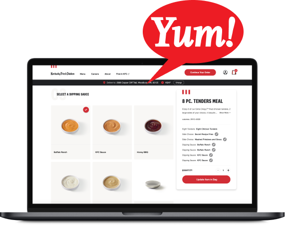
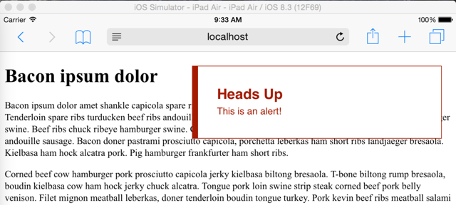
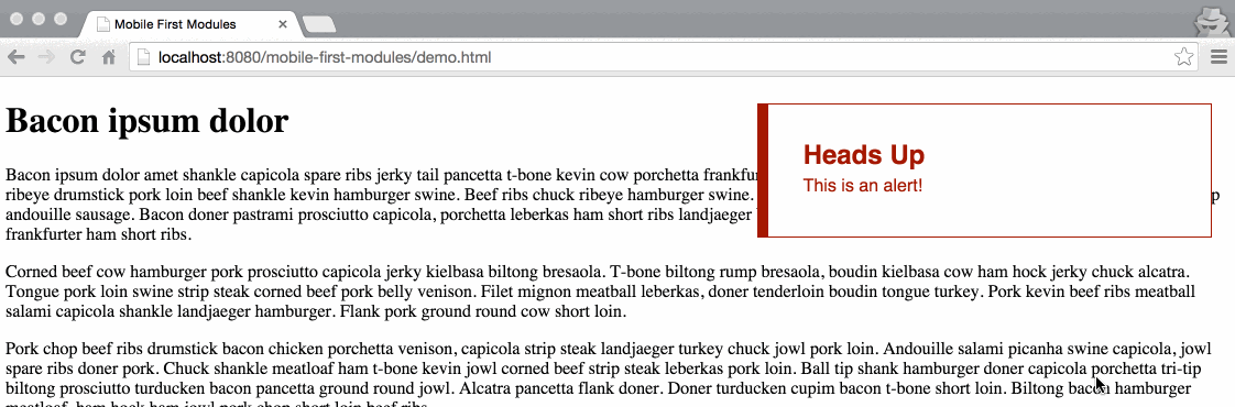
Let’s check this out by making a simple alert module. We will be using mixins to define our breakpoints, a single file to define our alert for all devices, and using relative units to create the most adaptable set of breakpoints. The final product will look something like this on a desktop:
Desktop view of alert module.
To see all the code on Github, click here.
1. Creating Reusable Breakpoints
Our first task is to create our various breakpoints in their own breakpoints.less file. Here is what I use for some of my projects. I prefer to define my breakpoints with ems(or rems), because it accommodates user font size preferences and scales nicely if the user zooms in and out of their browser.
/*
LARGER MOBILE DEVICES
~481px+
*/
.bp-mobile(@rules) {
    @media only screen and (min-width: 28.75em) { @rules(); }
}

/*
TABLET & SMALLER LAPTOPS
~768px+
*/
.bp-tablet(@rules) {
    @media only screen and (min-width: 40.5em) { @rules(); }
}

/*
DESKTOP
~1030px+
*/
.bp-desktop(@rules) {
    @media only screen and (min-width: 64.375em) { @rules(); }
}

/*
LARGE VIEWING SIZE
~1240px+
*/
.bp-large-screen(@rules) {
    @media only screen and (min-width: 77.5em) { @rules(); }
}
You will see all the breakpoints expect a set of rules. Now let’s put them to use!
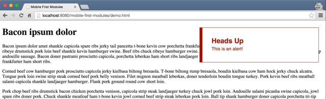
2. Mobile First Alert
Mobile View of Alert Module
.alert {

    display: block;
.alert {
    display: block;
    font-family: sans-serif;
    background: #FFFFFF;
    border: #A51A00 1px solid;
    border-left: #A51A00 10px solid;
    color: #A51A00;
    padding: 2em;

    h1 {
        margin: 0;
        font-size: 1.5em;
    }

    p {
        margin: 0.25em 0 0.25em 0;
        font-size: 1em;
        line-height: 1.25em;
    }
}
3. Adapting The Module for Larger Screens
Hooray! Lets update our styles for tablets and bigger screens. I am going to position my alert absolute and have it hang out in the upper right hand corner. On a tablet we want it to be 45% wide, but on a larger desktop it should only be 30% wide. We simply call our tablet and desktop breakpoint mixins and adjust the alert styles accordingly.
.alert {
    display: block;
    font-family: sans-serif;
    //... the rest of our mobile styles ...

    //tablets and larger
    .bp-tablet ({
        display: inline-block;
        width:45%;
        position: absolute;
        top: 1.5em;
        right: 1.5em;
    });

    //desktops and larger
    .bp-desktop ({
        width: 30%;
    });
}
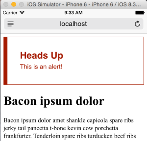
Tablet view of alert module.
The Final Product
Here is what our alert now looks like in mobile, tablet and desktop. Bonus points, we can quickly test the look and feel of our module in our browser by zooming in and out to see it hit the different breakpoints, because we used the relative unit “em”.
Zooming in and out in desktop.
Brilliant! We are at a solid starting point to continue to build out a mobile first components/modules library. How awesome is that? To see all the code on Github, click here.
Questions? Comments? Post ‘em below. Want to see more awesome posts on LESS/CSS, and Javascript, follow us on twitter @bitovi!
 development
 Previous Post