


.svg)


.png)
DoneJS doesn't just make it easy to build high performance, real-time web and mobile applications. It can also be used to create reusable plugins that can be shared across different applications. We also went over this post in one of our weekly trainings:
In this article we will create a reusable number input widget using Bootstrap styles in 9 straightforward steps. In addition to building the widget itself, we’ll give it tests, continuous integration, build it to many different module formats, and publish it to npm.
- Create the project on GitHub
- Initialize the repository as a new DoneJS plugin
- Set up continuous integration with Travis CI
- Start development mode
- Implement the component functionality and tests
- Make a pull request to the repository
- Make a build
- Publish to npm
- Use the plugin in other projects
You can find the code in the donejs-number-input repository. The final result looks like this:
Create the project on GitHub
We will use GitHub to host the code for the project, which makes it easy for others to contribute.
If you don't have an account yet, go to GitHub to sign up and follow the help to set it up for the command-line git. Once completed, you can create a new repository from your dashboard.
Important: In the remainder of the article the plugin name will be
<username>-number-input. You will have to replace<username>with your GitHub username to get a unique module name that can be published to npm.
Calling the repository <username>-number-input and initializing it empty (without any of the default files) looks like this:
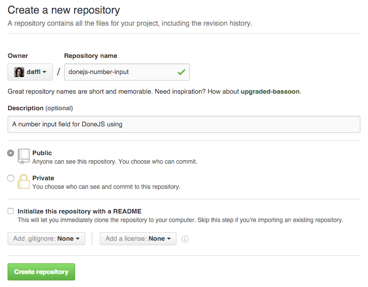
After creating the repository, we can clone it into a new folder:
$ git clone git@github.com:<username>/<username>-number-input.git

$ cd <username>-number-input
Initialize the repository as a new DoneJS plugin
To initialize a new plugin you will need DoneJS version 0.7.0+ installed globally. To check your DoneJS version run
$ donejs --version
To install DoneJS or to get the latest version run:
$ npm install donejs -g
In the <username>-number-input folder we can now initialize a new plugin like this:
$ donejs plugin
The plugin generator will ask several questions that should be answered as follows:
- Project name: Confirm the default by pressing enter
- GitHub username or organization: Enter the GitHub username where the repository has been created
- All other fields can also be answered with the default
Once all done, the final prompt looks similar to this:
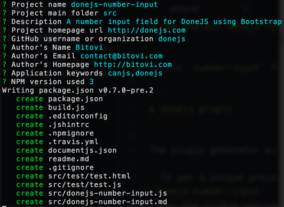
Now the generator will initialize the default plugin layout and install all its dependencies.
Set up continuous integration with Travis CI
When the installation has completed, we can make sure everything got set up properly by running:
$ npm test
This will open a Firefox browser, run two automatically generated tests and output the result on the console.
This command can also be used to automatically run the tests on a continuous integration server. There are many open source CI servers, the most popular being Jenkins, and many hosted solutions like Travis CI.
We will use Travis CI as our hosted solution because it is free for open source projects. It automatically works with your GitHub account. Once signed in, go to Accounts (in the dropdown under you name) to enable the <username>-number-input repository:

You may have to click the "Sync account" button for the repository to show up. Now, every time we push to GitHub the tests will run automatically. We can do so with our initial commit:
$ git add . --all
$ git commit -am "Initial commit"
$ git push origin master
If you now go to https://travis-ci.org/<your-username>/<username>-number-input/builds you will see the build running and eventually turn green (which will update the badge that got added in the readme.md file).
Start development mode
Like a DoneJS application, a DoneJS plugin provides a development mode that starts a server and enables live-reload by running:
donejs develop
The server will run at http://localhost:8080. You can view the main test page at localhost:8080/src/test/test.html. Any changes to the test file or module will re-run the tests right away thanks to hot-module-swapping.
Implement the component functionality and tests
A plugin can contain anything from shared utility functions to model- or component collections. In our case we want to create a new component, which we can do like this:
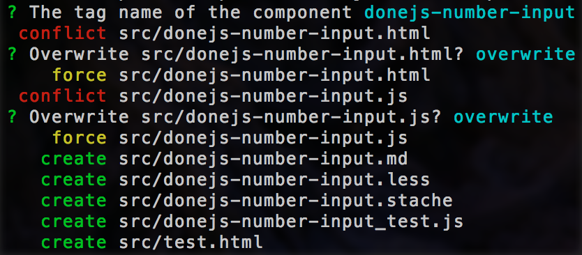
$ donejs add component <username>-number-input
This creates a complete component using the <username>-number-input tag with tests and documentation. Because the module name is the same as the plugin name (<username>-number-input), the generator will put the component files directly in the src/ folder (instead of a subfolder). Confirm the default tag name and and the prompts to overwrite the existing files by pressing enter:
The initialized component can now be viewed at localhost:8080/src/ -number-input.html . The component tests are available at localhost:8080/src/test.html.
Creating and testing the view-model
Our number input view-model should provide the following functionality:
- Update its value either through a number input field or +/- buttons
- Have a maximum and minimum value (which will also disable the proper button)
We can use the define plugin to define a min and max value and a setter for the value to make sure that it always is within those constraints. We will also add an increment and decrement method that will modify the value by 1. Change the component view-model (in src/<username>-number-input.js) to look like this:
import Component from 'can/component/';
import Map from 'can/map/';
import 'can/map/define/';
import './-number-input.less!';
import template from './-number-input.stache!';

export const ViewModel = Map.extend({
  define: {
    value: {
      value: 0,
      type: 'number',
      set(value) {
        if(value > this.attr('max')) {
          return this.attr('max');
        }

        if(value < this.attr('min')) {
          return this.attr('min');
        }

        return value;
      }
    },
    max: {
      value: Number.MAX_VALUE,
      type: 'number'
    },
    min: {
      value: 0,
      type: 'number'
    }
  },

  increment() {
    this.attr('value', this.attr('value') + 1);
  },

  decrement() {
    this.attr('value', this.attr('value') - 1);
  }
});

export default Component.extend({
  tag: '<username>-number-input',
  viewModel: ViewModel,
  template
});
To test this functionality we can change the tests in src/<username>-number-input_test.js to look like this:
import QUnit from 'steal-qunit';
import { ViewModel } from './-number-input.js';

// ViewModel unit tests
QUnit.module('-number-input/component');

QUnit.test('Initializes the ViewModel', function(){
  var vm = new ViewModel();

  QUnit.equal(vm.attr('value'), 0,
    'Default value is 0');
  QUnit.equal(vm.attr('max'), Infinity,
    'Max value is infinity');
  QUnit.equal(vm.attr('min'), 0,
    'Max value is number max value');
});

QUnit.test('.increment', function(){
  var vm = new ViewModel();

  vm.increment();
  QUnit.equal(vm.attr('value'), 1, 'Value incremented');
});

QUnit.test('.decrement', function(){
  var vm = new ViewModel();

  vm.increment();
  vm.increment();
  vm.decrement();
  QUnit.equal(vm.attr('value'), 1, 'Value updated');
});
You can run all tests either by going to localhost:8080/src/test/test.html in the browser or via
$ npm test
In the template we will use Bootstrap, which we first have to install as a dependency of the plugin:
$ npm install bootstrap --save
Adding the template
Then we can update src/<username>-number-input.stache to look like this:
<can-import from="bootstrap/less/bootstrap.less!" />
<form class="form-inline">
  <div class="form-group">
    <div class="input-group">
      <div class="input-group-btn">
        <button class="btn btn-primary" type="button"
          {{#eq value min}}disabled{{/eq}}
          ($click)="decrement">
            -
          </button>
      </div>
      <input type="number" class="form-control"
        {($value)}="value">
      <div class="input-group-btn">
        <button class="btn btn-primary" type="button"
          {{#eq value max}}disabled{{/eq}}
          ($click)="increment">
            +
        </button>
      </div>
    </div>
  </div>
</form>
Notice a few things about this template:
- This template first imports the Bootstrap LESS.
- Then we create a button group with a
-button on the left, a number input in the middle and a+button on the right. - When the buttons are clicked the
incrementordecrementview-model methods are being called. - The value of the input field is two-way bound with the
valueproperty of the view-model. - When the value is either
minormax, the-or+buttons will be disabled.
Make a pull request to the repository
Although we are working on the plugin by ourselves for now, GitHub pull requests are a great way to keep track of our progress and to make sure that all tests are passing. In the plugin folder we can run:
$ git checkout -b number-input-component
$ git add . --all
$ git commit -m "Implementing number-input component functionality, template and tests"
$ git push origin number-input-component
And then create a new pull request by going to https://github.com/<your-username>/<username>-number-input which will now show an option like this:

Once you created the pull request, you will see a Some checks haven’t completed yet message that will eventually turn green:
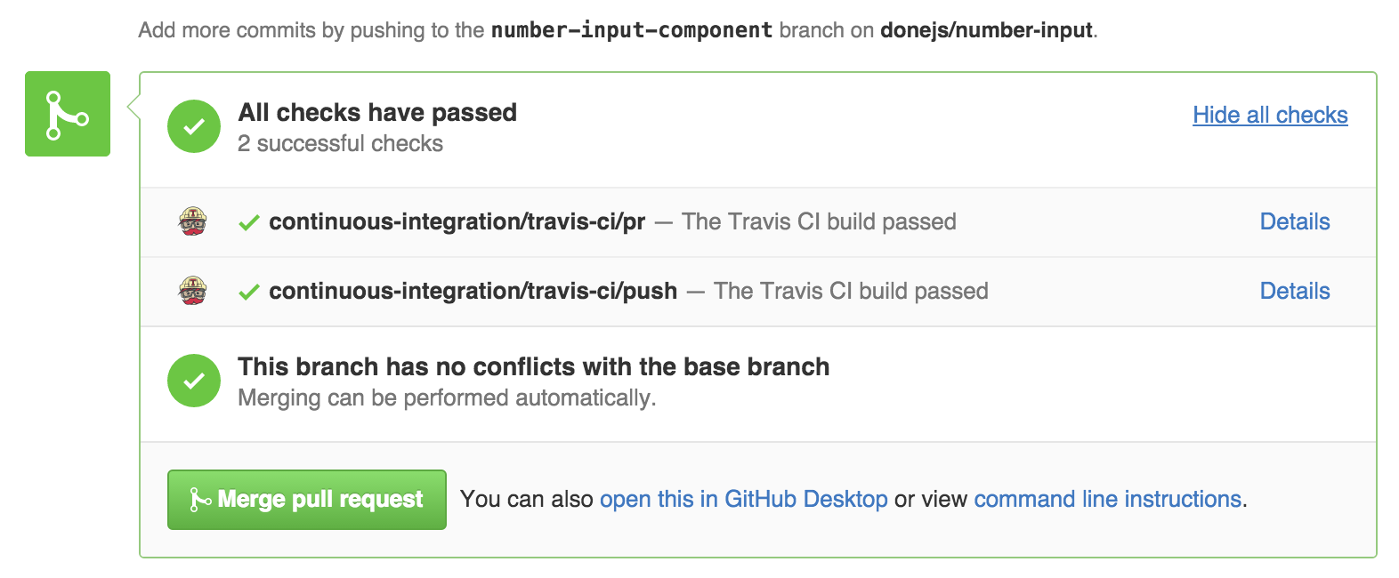
Now you can click the "Merge pull request" button. Then in the console, checkout the master branch and pull down the latest changes with:
$ git checkout master
$ git pull origin master
Make a build
Now that we implemented the number input functionality and have all tests passing we can make a build of our plugin that is usable standalone in the Browser, with an AMD module loader like RequireJS or as a CommonJS module which works e.g. with Browserify.
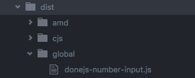
$ donejs build
Will create a dist/ folder with the global, amd and cjs version of our plugin:
Publish to npm
npm is the best way to share modules and make them easily installable without having to manage dependencies manually. To be able to publish your own modules, create a new account and then run
$ npm login
Semantic versioning is a great way to communicate new features and breaking changes. The generated plugin already comes with the release scripts to publish new versions according to the major.minor.patch schema. In our case to publish an initial version 0.1.0 we can run
$ donejs release:minor
Now version 0.1.0 of our plugin is available on npm.
Use the plugin in other projects!
In another DoneJS application we can now install the plugin with
$ npm install <username>-number-input --save
Then import it in a template and load it with:
<can-import from="donejs-number-input" />
<donejs-number-input></donejs-number-input>
Replace donejs with your <username>.
Wrapping up
In this article we created a reusable number spinner plugin for DoneJS with the code on GitHub and the tests running in continuous integration. We published a version for different module loaders on npm, making it installable and usable in other DoneJS applications.
Now go build some amazing plugins, let us know about them, and share them with the community!