


Slotted content page
Use slot elements to allow more control over non-critical parts of your component.
Overview
In this part we will:
- Use
slotelements to allow customization.
Problem
In the previous section we allowed the header to be styled with a few CSS properties. We could continue to add more custom properties so even more of the header could be customized. For example, we could allow the user of our component to change the heading text by providing an attribute like title="My Bus Tracker".
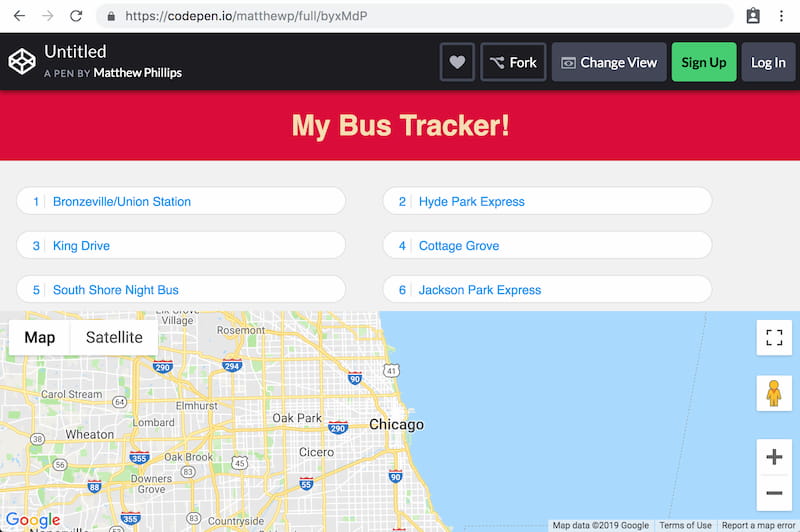
An easier way to allow consumers of your component to have complete control is to use slots. In this part we want to allow the header to be replaced with a custom header. In the end it should look like:
How to Solve This Problem
- Provide a slot for the custom header passed to
bus-tracker. - Use named slots to allow the
headerslot to be provided by the user. - Add custom styles to style the new header.
Technical requirements
Use this markup as the header that is passed into the component:
<header>
  <h1>My Bus Tracker!</h1>
</header>
And use this CSS to style the header:
background: crimson;
color: wheat;
text-align: center;
What you need to know
- How the slot element works.
- How to give slots names to allow multiple slotted content.
Slots
The slot has a curious effect when used within shadow DOM. It will take DOM within the custom element’s children and inject (but not move) those nodes as children of itself.
Default content can be specified by nesting DOM inside of the <slot> element.
<template>
  <slot>This is using <strong>default</strong> content.</slot>
</template>

<div id="one"></div>
<div id="two">
  This is using slotted content.
</div>

<script type="module">
let template = document.querySelector('template');

let one = document.querySelector('#one');
one.attachShadow({ mode: 'open' });
one.shadowRoot.append(document.importNode(template.content, true));

let two = document.querySelector('#two');
two.attachShadow({ mode: 'open' });
two.shadowRoot.append(document.importNode(template.content, true));

document.body.append(one, two);
</script>
Named slots
Named slots are used when you want to take some of the children content, but not all of it. This is useful when you have multiple things to be customized. It works like <slot name="header">, with the children needing to add a slot attribute. <header slot="header">.
<div class="my-thing">
  <header slot="header">
    <h1>My Header</h1>
  </header>
</div>

<template>
  <slot name="header">
    <header>Default Header</header>
  </slot>
</template>

<script type="module">
let el = document.querySelector('.my-thing');
el.attachShadow({ mode: 'open' });

let template = document.querySelector('template');
let frag = document.importNode(template.content, true);

el.shadowRoot.append(frag);
</script>
Solution
✏️ Wrap the <header> within the bus-tracker component with a <slot name="header">. This will completely replace the header if a child element provides the slot="header" attribute value.
Click to see the solution
<style>
  html,
  body {
    height: 100%;
  }
  body {
    font-family: "Catamaran", sans-serif;
    background-color: #f2f2f2;
    display: flex;
    flex-direction: column;
    margin: 0;
  }
  bus-tracker {
    --header-background: salmon;
    --header-text-transform: capitalize;
  }
  header[slot=header] {
    background: crimson;
    color: wheat;
    text-align: center;
  }
</style>
<script src="https://maps.googleapis.com/maps/api/js?key=AIzaSyD7POAQA-i16Vws48h4yRFVGBZzIExOAJI"></script>

<bus-tracker>
  <header slot="header">
    <h1>My Bus Tracker!</h1>
  </header>
</bus-tracker>

<template id="bt-template">
  <style>
    :host {
      display: flex;
      flex-direction: column;
    }

    .top {
      flex-grow: 1;
      overflow-y: auto;
      height: 10%;
      display: flex;
      flex-direction: column;
    }

    footer {
      height: 250px;
      position: relative;
    }
    .gmap {
      width: 100%;
      height: 250px;
      background-color: grey;
    }

    header {
      box-shadow: 0px 3px 5px 0px rgba(0, 0, 0, 0.1);
      background-color: var(--header-background, #313131);
      color: white;
      min-height: 60px;
      display: flex;
      flex-direction: column;
      justify-content: center;
      line-height: 1.2;
    }

    header h1 {
      text-align: center;
      font-size: 18px;
      text-transform: var(--header-text-transform, uppercase);
      letter-spacing: 1px;
      margin: 0;
    }
    #selected-route:not(.route-selected) {
      display: none;
    }
    .route-selected {
      line-height: 1;
      position: absolute;
      z-index: 1;
      text-align: right;
      background: rgba(6, 6, 6, 0.6);
      top: 10px;
      right: 10px;
      padding: 6px 10px;
      color: white;
      border-radius: 2px;
      cursor: pointer;
    }
    .route-selected small {
      display: block;
      font-size: 14px;
      color: #ddd;
    }
    .route-selected .error-message {
      font-size: 14px;
      background-color: #ff5722;
      border-radius: 10px;
      padding: 4px 8px 1px;
      margin-top: 5px;
    }
    .routes-list {
      padding: 20px 0;
      margin: 0;
      overflow-y: auto;
    }
    .routes-list li {
      list-style: none;
      cursor: pointer;
      background: white;
      border: 1px solid #dedede;
      margin: 1% 2%;
      border-radius: 25px;
      color: #2196f3;
      width: 41%;
      display: inline-flex;
      font-size: 14px;
      line-height: 1.2;
    }
    .routes-list li:hover {
      border-color: transparent;
      background-color: #008eff;
      color: white;
      box-shadow: 0px 5px 20px 0px rgba(0, 0, 0, 0.2);
    }
    .routes-list li .check {
      display: none;
    }
    .routes-list li.active {
      color: #666;
      background-color: #e8e8e8;
    }
    .routes-list li.active .check {
      display: inline-block;
      margin-left: 5px;
      color: #2cc532;
    }
    .routes-list li.active:hover {
      border-color: #dedede;
      box-shadow: none;
    }
    .routes-list button {
      width: 100%;
      padding: 8px 8px 6px;
      border: none;
      border-radius: 25px;
      background: transparent;
      text-align: left;
      font: inherit;
      color: inherit;
    }
    .route-number {
      display: inline-block;
      border-right: 1px solid #dedede;
      padding-right: 5px;
      margin-right: 5px;
      min-width: 18px;
      text-align: right;
    }
    p {
      text-align: center;
      margin: 0;
      color: #ccc;
      font-size: 14px;
    }
  </style>
  <div class="top">
    <slot name="header">
      <header>
        <h1>Chicago CTA Bus Tracker</h1>
        <p id="loading-routes">Loading routes…</p>
      </header>
    </slot>

    <ul class="routes-list"></ul>
  </div>
  <footer>
    <button id="selected-route" type="button">
    </button>

    <google-map-view></google-map-view>
  </footer>
</template>
<template id="error-template">
  <div class="error-message">
    No vehicles available for this route
  </div>
</template>
<template id="gmap-template">
  <style>
    .gmap {
      width: 100%;
      height: 250px;
      background-color: grey;
    }
  </style>
  <div class="gmap"></div>
</template>
<template id="route-template">
  <li>
    <button type="button">
      <span class="route-number"></span>
      <span class="route-name"></span>
      <span class="check">✔</span>
    </button>
  </li>
</template>
<script type="module">
const template = document.querySelector('#gmap-template');

class GoogleMapView extends HTMLElement {
  constructor() {
    super();
    this.attachShadow({ mode: 'open' });

    let nodes = document.importNode(template.content, true);
    this.shadowRoot.append(nodes);

    this.markers = null;
    this._vehicles = null;
  }

  connectedCallback() {
    let gmap = this.shadowRoot.querySelector('.gmap');
    this.map = new google.maps.Map(gmap, {
      zoom: 10,
      center: {
        lat: 41.881,
        lng: -87.623
      }
    });
  }

  get vehicles() {
    return this._vehicles;
  }

  set vehicles(newVehicles) {
    this._vehicles = newVehicles;
    if (this.markers) {
      for(let marker of this.markers) {
        marker.setMap(null);
      }
      this.markers = null;
    }
    if (newVehicles) {
      this.markers = newVehicles.map(vehicle => {
        return new google.maps.Marker({
          position: {
            lat: parseFloat(vehicle.lat),
            lng: parseFloat(vehicle.lon)
          },
          map: this.map
        });
      });
    }
  }
}

customElements.define('google-map-view', GoogleMapView);

const apiRoot = "https://cta-bustracker.vercel.app/api/";
const getRoutesEndpoint = apiRoot + "routes";
const getVehiclesEndpoint = apiRoot + "vehicles";

const btTemplate = document.querySelector('#bt-template');
const routeTemplate = document.querySelector('#route-template');
const errorTemplate = document.querySelector('#error-template');

class BusTracker extends HTMLElement {
  constructor() {
    super();
    this.attachShadow({ mode: "open" });

    let frag = document.importNode(btTemplate.content, true);
    this.shadowRoot.append(frag);

    this.routesList = this.shadowRoot.querySelector('.routes-list');
    this.selectedRouteBtn = this.shadowRoot.querySelector('#selected-route');
    this.googleMapView = this.shadowRoot.querySelector('google-map-view');
  }

  connectedCallback() {
    this.getRoutes();
  }

  async getRoutes() {
    let response = await fetch(getRoutesEndpoint);
    let data = await response.json();
    let routes = data["bustime-response"].routes;

    for(let route of routes) {
      let frag = document.importNode(routeTemplate.content, true);

      frag.querySelector('.route-number').textContent = route.rt;
      frag.querySelector('.route-name').textContent = route.rtnm;

      frag.querySelector('button').addEventListener('click', ev => {
        this.pickRoute(route, ev.currentTarget.parentNode);
      });

      this.routesList.append(frag);
    }

    this.shadowRoot.querySelector('#loading-routes').remove();
  }

  async getVehicles(route) {
    let response = await fetch(getVehiclesEndpoint + '?rt=' + route.rt);
    let data = await response.json();

    this.selectedRouteBtn.innerHTML = `
      <small>Route ${this.route.rt}:</small> ${this.route.rtnm}
    `;

    if (data['bustime-response'].error) {
      let frag = document.importNode(errorTemplate.content, true);
      this.selectedRouteBtn.append(frag);
      this.googleMapView.vehicles = [];
    } else {
      let vehicles = data['bustime-response'].vehicle;
      this.googleMapView.vehicles = vehicles;
    }

    this.selectedRouteBtn.classList.add('route-selected');
  }

  pickRoute(route, li) {
    this.route = route;
    this.getVehicles(route);

    if(this.activeRoute) {
      this.activeRoute.classList.remove('active');
    }
    this.activeRoute = li;
    this.activeRoute.classList.add('active');
  }
}

customElements.define("bus-tracker", BusTracker);
</script>