
I’m super excited about CSS grid, because finally there’s a way to layout pages and achieve more interesting and dynamic results, without a ton of code! So since I fell in love with Atom IDE recently (I know, I’m late to the party, but really I like it 😺), then it’s no surprise that I will be using it for this example on CSS grid layout.
Diving into CSS Grid
CSS grid is so thrilling and has so much going on that I feel like a little kid in a candy store: I don’t know where to even start and can get overwhelmed too quickly. So this article is going to be a warm-up exercise on using CSS grid in the most straightforward way, while building a semi-complex layout.
This is what the end result will be:
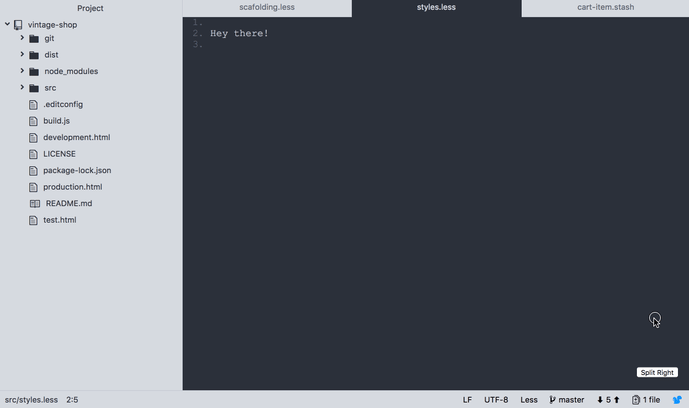
See the Pen Using CSS Grid to build a page layout on CodePen.
Note that there is some little jQuery in the codepen, bit this is only used to add and remove a CSS class.
And the steps that we'll follow:
- Define the Page Layout
- Define the Panel Module
- Define that Tabs Module
- Define the Editor Windows
- Define the Footer
Step 1: Define the Page Layout
The HTML structure of the editor will be very simple. There will be a wrapper called .page, and inside a .sidebar, an .editor and a .footer:
<div class="page">
  <div class="sidebar">...</div>
  <div class="editor">...</div>
  <div class="footer">...</div>
</div>
Then with CSS grid, we can define how the structure should be laid out:
.page {
	display: grid;
	grid-template-rows: auto 30px;
	grid-template-columns: 300px 1fr;
	height: 100vh;
}
And 🎉!
The layout of the page is set. Here's how that structure looks visually:
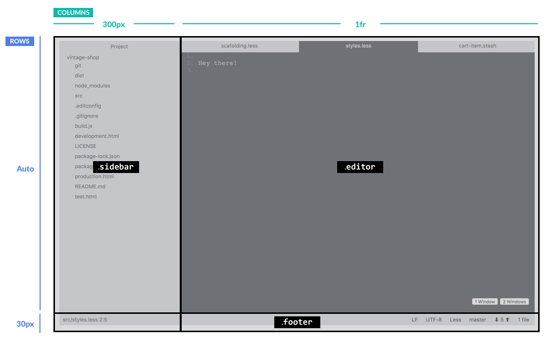
This is great and super straightforward. You basically say: “Hey, here’s this grid, and I want it to have so many rows (in this case 2) and I want each to be this wide: auto and 30px.” If you want more rows, you can just keep adding more widths. The same thing goes for the columns. This layout has two columns set to 300px and 1fr.
Now, you may be wondering why 1fr instead of auto? (By the way: fr stands for “fraction”. For more info about it, head to this post on CSS Tricks.) In this case, 1fr works well because the .editor area will be split into multiple fractions, for the editor windows, which we’ll cover in step 4.
Something else to note is that we want the footer to take the entire second row. To accomplish this, we will apply more CSS grid magic:
.footer {
	grid-column-start: 1;
	grid-column-end:   3;
}
Here we are using grid-column-start to tell the grid, “Hey, I want this element .footer to start on the first column” and then we use grid-column-end to tell it: “This element should end on column 3”. This may seem a bit confusing, because there are only two columns in our grid, but it basically means it should stop at the end of the 2nd column, which I guess is technically the beginning of the 3rd, right?
So far your CSS should look like this:
/** Scafolding **/
.page {
	display: grid;
	grid-template-rows: auto 30px;
	grid-template-columns: 300px 1fr;
	height: 100vh;
}

/** Footer **/
.footer {
	grid-column-start: 1;
	grid-column-end:   3;
}
Step 2: Define the Panel Module
Looking at the contents of the .sidebar and the .editor, I see a pattern (let's call it a .panel) that we can abstract, so it can be used in both cases. Basically, this .panel is a container with a fixed header and a body that takes the available space of the screen. This body also needs to be scrollable so the entire content can be accessed. With these requirements in mind, let's write the CSS.

First, let's define a height for our “bars”. This height will be used to set the height of the footer and of the header of the panel. :root { --bar-height: 30px; }
Then, we define the .panel to be displayed as a grid and create two rows: one with the height of the panel header and one as tall as the available space, which will be the panel body.
.panel {
	display: grid;
	grid-template-rows: var(--bar-height) auto;
}
So far, it’s pretty straightforward. However, I discovered that the footer was pushed down below the fold if the content of the body in the panels took the available space in the screen:
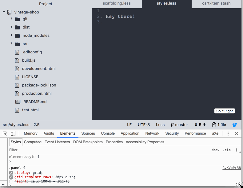
I feel like CSS grid failed me here 😞 as I was expecting the footer to stay docked to the bottom of the screen. Maybe I'm missing something? If you know what is going on here be sure to post in the comments. Anyway, this is how I coped with it: I used calc and subtracted the height of the footer from the height of the screen.
.panel {
	...
	height: calc(100vh - var(--bar-height) );
}
Here's how this translates visually:
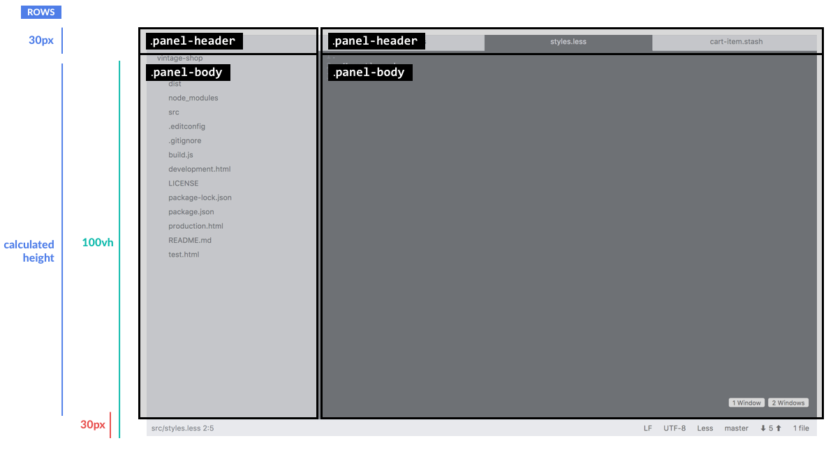
And to top this with a 🍒 let's make the panel body scrollable when needed.
.panel-body {
	overflow: auto;
}
With this .panel solution, we will be able to quickly build both the .sidebar and the .editor. Let’s look at the CSS we have so far:
/** Scafolding **/
.page {
	display: grid;
	grid-template-rows: auto 30px;
	grid-template-columns: 300px 1fr;
	height: 100vh;
}

/** Panel Module **/
.panel {
	display: grid;
	grid-template-rows: @bar-height auto;
	height: calc(100vh - var(--bar-height) );
}
.panel-body {
	overflow: auto;
}

/** Footer **/
.footer {
	grid-column-start: 1;
	grid-column-end:   3;
}
Step 3: Define the Tabs Module
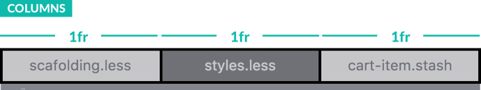
Another pattern that I thought could use CSS grid is the tabs in the editor because they are a grid of boxes in a single row, so the CSS is pretty simple:
.tabs {
	display: grid;
	grid-template-columns: repeat(3, 1fr);
	height: 100%;
}
Here, we are telling the grid that we want to “repeat” 3 columns, each one as wide as 1 fraction (or one third of the available space). But you could also give the tabs a fixed width for a more standard look. I can't think of a simpler way to define a UI for tabs!
.ellipsis {
    overflow: hidden;
	text-overflow: ellipsis;
	white-space: nowrap;
}
.tab-item {
	.ellipsis;
	text-align: center;
    padding: 6px;
}
At this point your CSS should look like this:
/** Variables **/
:root {
    --bar-height: 30px;
    --gray-dark: #2c313a;
    --gray-base: #5c6370;
    --gray-light: #c5cad3;
    --gray-lighter: #d7dae0;
    --gray-lightest: #dcdfe4;
    --blue: #1f96ff;
    --border-default: 1px solid var(--gray-light);
}

/** Mixins **/
@mixin .ellipsis {
    overflow: hidden;
	text-overflow: ellipsis;
	white-space: nowrap;
}

/** Scafolding **/
.page {
	display: grid;
	grid-template-rows: auto 30px;
	grid-template-columns: 300px 1fr;
	height: 100vh;
}

/** Panel Module **/
.panel {
	display: grid;
	grid-template-rows: var(--bar-height) auto;
	height: calc(100vh - var(--bar-height) );
}
.panel-body {
	overflow: auto;
}

/** Tabs Module **/
.tabs {
	display: grid;
	grid-template-columns: repeat(3, 1fr);
	height: 100%;
}
.tab-item {
	include .ellipsis;
	text-align: center;
    padding: 6px;
}

/** Footer **/
.footer {
	grid-column-start: 1;
	grid-column-end:   3;
}
Step 4: Define the Editor Windows
A neat thing about using CSS grid for the layout of the editor is that with one line of CSS the layout can be changed to accommodate multiple windows.
To accomplish this we set the .editor to display as a grid, and then apply the additional CSS class .editor--2-windows-layout when clicking on the button. This class will set the grid to display to two columns, each one taking 1 frame of the screen:
.editor {
	display: grid;
}
.editor .window-2  {
    display: none;
}
.editor .window-2 .editor--2-windows-layout {
    grid-template-columns: 1fr 1fr;
}
.editor .window-2 .editor--2-windows-layout .window-2 {
    display: grid;
}
I said one line of CSS, and there are more lines here 😏, hehe! But, really the one line that you want to pay attention to is .grid-template-columns: 1fr 1fr; which is the one changing the layout, so we can fit two windows in the editor without having to do any CSS acrobatics!
Here's a recap of what we have done so far:
/** Variables **/
:root {
    --bar-height: 30px;
    --gray-dark: #2c313a;
    --gray-base: #5c6370;
    --gray-light: #c5cad3;
    --gray-lighter: #d7dae0;
    --gray-lightest: #dcdfe4;
    --blue: #1f96ff;
    --border-default: 1px solid var(--gray-light);
}

/** Mixins **/
@mixin .ellipsis {
    overflow: hidden;
    text-overflow: ellipsis;
    white-space: nowrap;
}

/** Scaffolding **/
.page {
    display: grid;
    grid-template-rows: auto 30px;
    grid-template-columns: 300px 1fr;
    height: 100vh;
}

/** Panel Module **/
.panel {
    display: grid;
    grid-template-rows: var(--bar-height) auto;
    height: calc(100vh - var(--bar-height));
}

.panel-body {
     overflow: auto;
}

/** Tabs Module **/
.tabs {
    display: grid;
    grid-template-columns: repeat(3, 1fr);
    height: 100%;
}

.tab-item {
    include .ellipsis;
    text-align: center;
    padding: 6px;
}

/** Editor **/
.editor {
    display: grid;
}

.editor .window-2 {
    display: none;
}

.editor .window-2 .editor--2-windows-layout {
    grid-template-columns: 1fr 1fr;
}

.editor .window-2 .editor--2-windows-layout .window-2 {
    display: grid;
}

/** Footer **/
.footer {
    grid-column-start: 1;
    grid-column-end: 3;
}
Step 5: Define the Footer
We will do one last application of CSS grid in this layout for the footer. The footer has two areas. The first one shows the source of the file (let's call it footer-file-info) and the second one aligns to the left to display a series of controls (let's call this one footer-controls). When the editor is scaled, the controls on the right should maintain their position and the content on the left should flex to accommodate that:

To accomplish that, all we need to do is set the columns of the footer grid as follows:
.footer {
    display: grid;
    grid-template-columns: 1fr auto;
	...
}
This will make the .footer-controls as wide as its content, so more controls can be added without having to change the width. 1fr then allows the .footer-file-info to flex. By default, the content of this area will wrap, so you can add the CSS .ellipsis class that we created earlier for the tabs module to cope with that:
.footer-file-info {
    include .ellipsis;
}
Lastly, we will use flexbox to layout the .footer-controls:
.footer-controls {
	display: flex;
	height: 100%;
 	justify-content: flex-end;
}

.footer-controls a {
    height: 100%;
	display: flex;
	align-items: center;
}
Here's the CSS end result for the layout:
/** Variables **/
:root {
    --bar-height: 30px;
    --gray-dark: #2c313a;
    --gray-base: #5c6370;
    --gray-light: #c5cad3;
    --gray-lighter: #d7dae0;
    --gray-lightest: #dcdfe4;
    --blue: #1f96ff;
    --border-default: 1px solid var(--gray-light);
}

/** Mixins **/
@mixin .ellipsis {
    overflow: hidden;
	text-overflow: ellipsis;
	white-space: nowrap;
}

/** Scafolding **/
.page {
	display: grid;
	grid-template-rows: auto 30px;
	grid-template-columns: 300px 1fr;
	height: 100vh;
}

/** Panel Module **/
.panel {
	display: grid;
	grid-template-rows: var(--bar-height) auto;
	height: calc(100vh - var(--bar-height) );
}
.panel-body {
	overflow: auto;
}

/** Tabs Module **/
.tabs {
	display: grid;
	grid-template-columns: repeat(3, 1fr);
	height: 100%;
}
.tab-item {
	include .ellipsis;
	text-align: center;
    padding: 6px;
}

/** Editor **/
.editor {
    display: grid;
}

.editor .window-2 {
    display: none;
}

.editor .window-2 .editor--2-windows-layout {
    grid-template-columns: 1fr 1fr;
}

.editor .window-2 .editor--2-windows-layout .window-2 {
    display: grid;
}

/** Footer **/
.footer {
    display: grid;
    grid-template-columns: 1fr auto;
    grid-column-start: 1;
    grid-column-end: 3;
}

.footer-file-info {
    include .ellipsis;
}
.footer-controls {
    display: flex;
    height: 100%;
    justify-content: flex-end;
}

.footer-controls a {
    height: 100%;
    display: flex;
    align-items: center;
}
And that’s all there is to this CSS grid trickery 😀! What’s left is just to style the theme of the editor using color, alignment, and spacing.
So check out the CodePen, fork it, slice it, dice it, or come up with other themes and let me know what you think! I'm sure there’s a ton that can be improved. Thanks for reading!
If you'd like to try a different variation of the sticky header layout, I can show you how to Use Flexbox to Create a Sticky Header & Sidebar with Flexible Content.
Need a UX designer? We can help.
 user experience
Previous Post

Next Post