

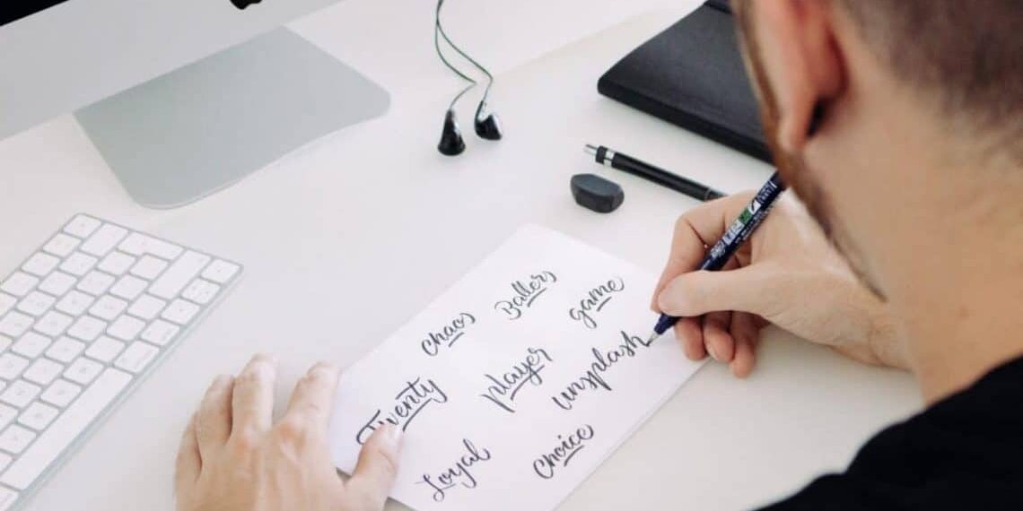
On trend: handwritten and animated typography
2020 was the year of animated and hand-written typography. This design trend is likely to continue into 2021. A few CodePen examples of the latest "live in the moment as you watch me write" trend:
- Se7ensky
- Marina
- Get Back to Business
- Marketing Lab
- Cassie
- and our very own "love" animation
Want to try it?
While handwriting animation could be created in programs like Adobe Animate or AfterEffects, the resulting animated GIF file would be large. So how do you create these impressive animations without compromising performance? Use vector graphics (SVG) for scalability and small file size, along with a pro-level JavaScript animation framework (GSAP) specifically designed for SVGs. Sorry, CSS animations won't cut it this time.
You may also like: Our article “Prepare for anything with GSAP” where we recount how and why we chose GreenSock as the best animation platform for a single-page app project.
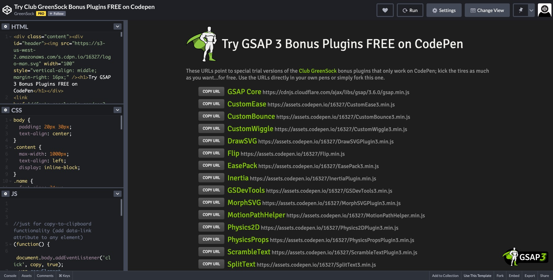
Note: Although GreenSock Animation Platform (GSAP) is free, even for commercial use, you'll need their DrawSVG plugin, which is only available to Club GreenSock members at a yearly membership fee of $75-150 per year (depending on which membership level you chose). However, you can Try GSAP 3 Bonus Plugins FREE on CodePen.
Here's what you'll need
- A vector design program like Adobe Illustrator, Sketch, Figma, Inkscape, etc.
- CodePen
- A text or code editor to open SVG files and copy code to CodePen. VSCode is a good one.
Meet Pen Tool, your new BFF
Once you have some handwriting picked out (vector or bitmap, it doesn't matter), your first step will be to fire up your vector design program. The instructions below were written for Illustrator.
Creating SVGs for handwriting animation is time-consuming, but well worth the effort. Why is it so tedious? I’ll explain.
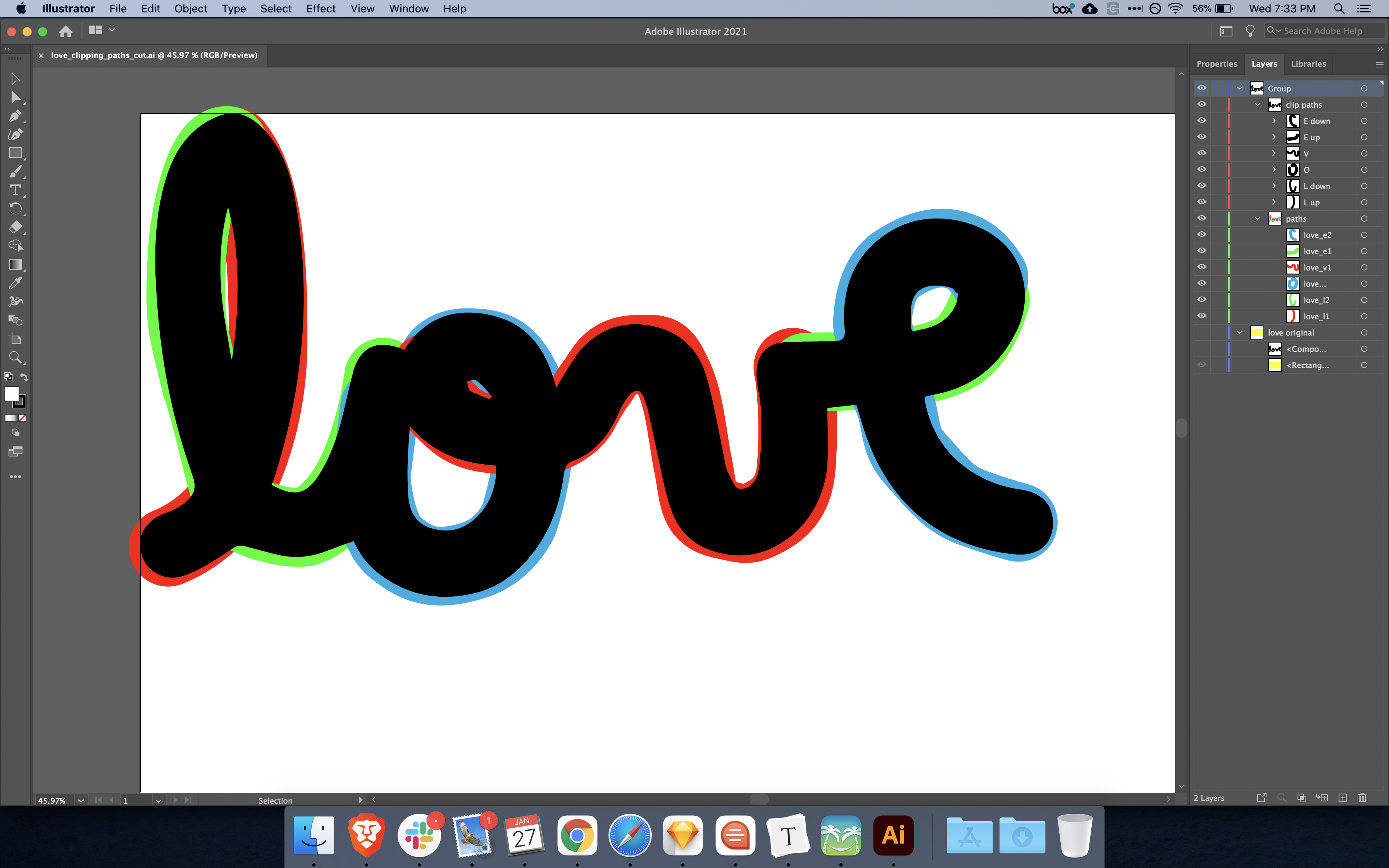
The word you want to write is often a compound path created using a custom typeface. Translation: it is a shape, not a line. You want to go from stamping the entire word at once (shape) to writing one in cursive (line). Since a shape does not have a path with a start and end point to follow or trace, you will have to create one.
Drawing and adjusting a path takes time. You'll become very comfortable using Adobe Illustrator's Pen Tool and Anchor Point Tool.
This path is what you will tell the animation code to trace. Imagine a big fat marker following and drawing over a thin faint pencil line.
Of course, that big fat marker can only draw a big fat line (always the same width), so if you want your handwriting to have a variable width stroke (like that of a calligraphy brush or pen), you'll need to use a stencil.
Clipping paths function as a stencil to cut off the outer edges of a stroke, making the line is the exact width and shape you want. You’re going to turn that big fat marker into a brush or calligraphy pen.
This means you will need to draw a path (line) and clipping path (stencil) for each word letter stroke. That means many paths and clipping paths for you and Pen Tool. Skip to the section titled, “Multiple paths vs a single path”, to learn why.
Once you've drawn your paths (you're 90% done at this point), you'll export them as SVG files, copy and paste the SVGs into CodePen, and animate them using GSAP. Believe me, once you leave Illustrator land, it's all downhill.
Optionally, you can use SVGOMG to optimize the SVG prior to animation.
Copy paths and stencils to CodePen
Now that you have paths and clipping paths exported as SVGs, it's time to open them in your code editor, then copy and paste them into CodePen. Fork the pen below as a template.
HTML
In the HTML tab, create your SVG as follows:
<svg id="love" ... >
  <g id="clips">  <!-- These are your clipping paths or stencils -->
    <clipPath id="clipPath-1">
      <path d="..." />
    </clipPath>
    <clipPath id="clipPath-2">
      <path d="..." />
    </clipPath>
  </g>
  <g id="strokes"> <!-- These are your paths or lines -->
    <path clip-path="url(#clipPath-1)" class="path" d="..." />
    <path clip-path="url(#clipPath-2)" class="path" d="..." />
  </g>
</svg>
CSS
In the CSS tab, set the width of your SVG.
svg {
  width: 40vw;
}
JS
You'll want the following external scripts. In CodePen, click the Settings button, then the JS tab, then scroll to the Add External Scripts/Pens section, and add:
- https://unpkg.co/gsap@3/dist/gsap.min.js
- https://assets.codepen.io/16327/DrawSVGPlugin3.min.js
- https://unpkg.com/gsap@3/dist/MotionPathPlugin.min.js
Then, write the following:
TweenMax.set(".path", { drawSVG: "0% 0%" });
tl_love = new TimelineMax({ delay: 2, repeat: 2 });
tl_love.set("#love", { autoAlpha: 1 });
This tells GSAP to get ready for the magic. "tl_" is an abbreviation for "timeline", however, you could name the variable whatever you like.
If you want to animate (draw, write) all strokes at the same speed, code:
/* Animate all strokes at the same speed */
gsap.utils.toArray(".path").forEach(path => {
tl_love.to(path, 0.3, { drawSVG: "100%", ease: Linear.easeNone, stagger: 0.1 })
});
If you want more control, since some strokes are longer/shorter and more/less complex than others, code:
/* Animate each stroke at a different speed */
tl_love.to(".path_l1", 0.5, { drawSVG:"100%", ease: Linear.easeNone, stagger: 0.1 })
tl_love.to(".path_l2", 0.5, { drawSVG:"100%", ease: Linear.easeNone, stagger: 0.1 })
tl_love.to(".path_o1", 0.7, { drawSVG:"100%", ease: Linear.easeNone, stagger: 0.1 })
tl_love.to(".path_v1", 0.7, { drawSVG:"100%", ease: Linear.easeNone, stagger: 0.1 })
tl_love.to(".path_e1", 0.3, { drawSVG:"100%", ease: Linear.easeNone, stagger: 0.1 })
tl_love.to(".path_e2", 0.5, { drawSVG:"100%", ease: Linear.easeNone, stagger: 0.1 })
Ta-dah! You should be up and running writing.
Here at Bitovi, we love a challenge. If you are interested in sprucing up your web application, we are here to help. Find out more on our Visual Design page.
Multiple paths vs a single path
Here's why you don't want to use a single path: you'll get unwanted bleeds and artifacts where letter strokes cross over each other. Compare v1.0, which uses a single path and a single clipping path/stencil for the entire word, to v2.0, which uses multiple paths and clipping paths, a pair for each stroke.
v1.0
v2.0
Additional Resources
Learn more from these tutorials.
- How to Get Handwriting Animation With Irregular SVG Strokes, CSS-Tricks, Trapti Rahangdale on September 14, 2020
- SVG Calligraphy Handwriting Animation, Motion Tricks, August 4, 2020
- Handwriting Effect with DrawSVG, GreenSock, July 14, 2020
- Animated handwriting effect (part 1), Motion Tricks, June 9, 2020
- Creating my logo animation, Cassie, Cassie Evans, July 30, 2019
- How to Get Handwriting Animation With Irregular SVG Strokes, Medium, Meghan Sterling, April 29, 2018

Next Post
