Using a living style guide (LSG) to drive development is a practice that is gaining a lot of popularity because its many advantages, including code efficiency and UI consistency. But, how can you create one? What should you include? And where do you even start? In this 3 part tutorial I will delve into the nitty-gritty details of creating a living style using DocumentCSS.
Tutorial Part 1
In this part of the tutorial we will be:
- Doing a quick intro on living styles guides
- Learning about Style Guide Generators
- Planning a living style guide that you can use as a baseline for your projects.
The Beauty of Living Style Guides
Similar to a standard style guide, a living style guide provides a set of standards for the use and creation of styles for an application. In the case of a standard style guide, their purpose is to maintain brand cohesiveness and prevent the misuse of graphics and design elements. In the same way LSGs are used to maintain consistency in an application and to guide their implementation. But what makes a LSG different and more powerful is that much of its information comes right from the source code, making it easy and efficient to reflect the evolving state of an application.
.gif)
If you look at the examples below you will see the common denominators of a LSG are:
- A list of the elements that are documented
- Succinct documentation with code snippets and interactive UI demonstrations


Another key element of a LSG is that you can use a style guide generator to automate the process. A style guide generator will use your application source code to feed the bulk of your LSG documentation and watch for any changes made in your code, taking care of updating your style guide documentation as your application changes.
Style Guide Generators
There are many flavors to choose from, depending on the code language that you want to document or your project setup. Here are some places to look for options:
- An In-Depth Overview of Living Style Guide Tools, Robert Haritonov, Smashing Magazine
- Overview of Pattern Library Generators, David Hund, GitHub
- Style Guide Generator Roundup, Susan Robertson, A List Apart
- Style Guide Tools, Website Style Guide Resources
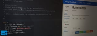
For this tutorial I will be showing you how you can use DocumentCSS to create your LSG. This tool created by Bitovi is open source and can be used in any project to document CSS (preprocessors like Less and SASS are supported as well). If you are interested in documenting Javascript and other languages, you can easily do it with DocumentCSS, as this tool is a subset of DocumentJS. I won’t be covering that part in this tutorial, but it’s good to have in mind.

Planning Your Style Guide
Before diving into creating your LSG the first step is planning what will be in it. Like any good website, a well structured Information Architecture (IE) is the key.
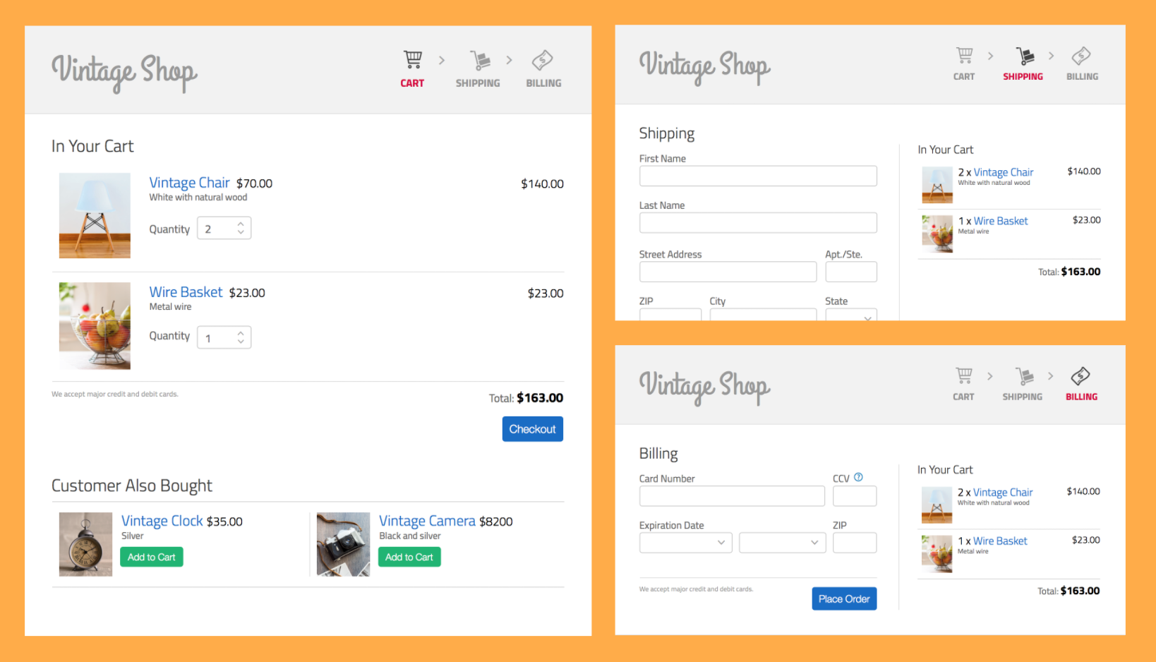
So let’s get started by using the following set of designs of our sample app called “Vintage Shop” and observe the persistent elements in the UI:
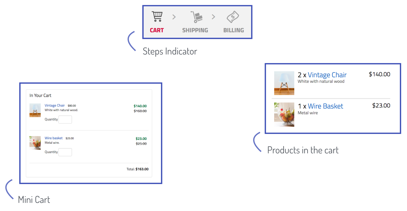
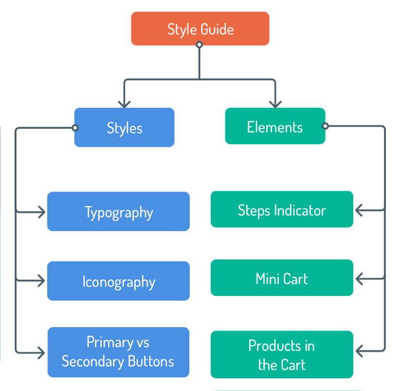
At this point I recommend starting with larger groups of elements, such as the navigation, the cart or the forms. For example, we’ll separate our design into these three groups: the steps indicator, the mini cart, and the products in the cart:
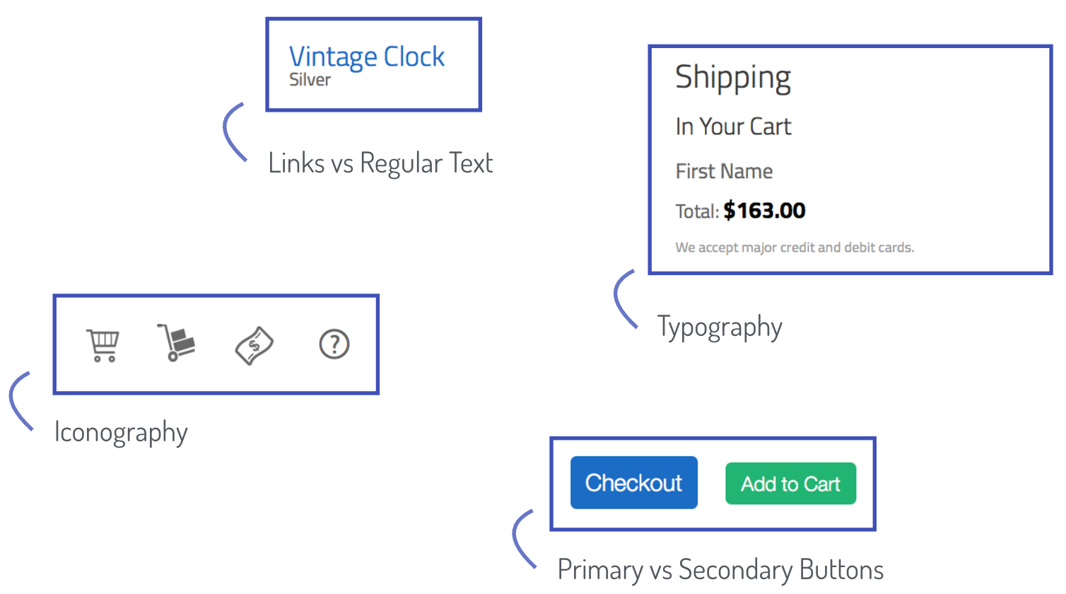
With these larger groups of elements, you can start going into more detail and identify the “styles” that persist. For example, there is a convention for the typography in general, and more specifically for the headings, the subheadings, and the links vs. regular text. The color of the buttons also persists across the pages.
Putting it all together, let’s write down these groups using a diagram:
Taking a deeper look into these groups you can fine tune them and turn them into categories that you can use in your style guide as it grows. For example:
- “Elements” is a very vague term that could refer to any HTML element, so a better name for this group could be “Components” or “Modules. These are still broad terms but are more specific in the nature of the type of elements that would cover.
- “Primary vs Secondary” buttons could be part of “Base Elements”, and the color aspect of it could go inside of a “Color Palette” category.
Additionally, you can think about a category where you can include more generic information about your style guide. A good example of that would be a “Guides” section where you could describe how to contribute to the style guide or a “Branding” section where you can include guidelines about your brand that should be kept in mind when designing and implementing your app.
With this in mind, here’s what the diagram would look like:
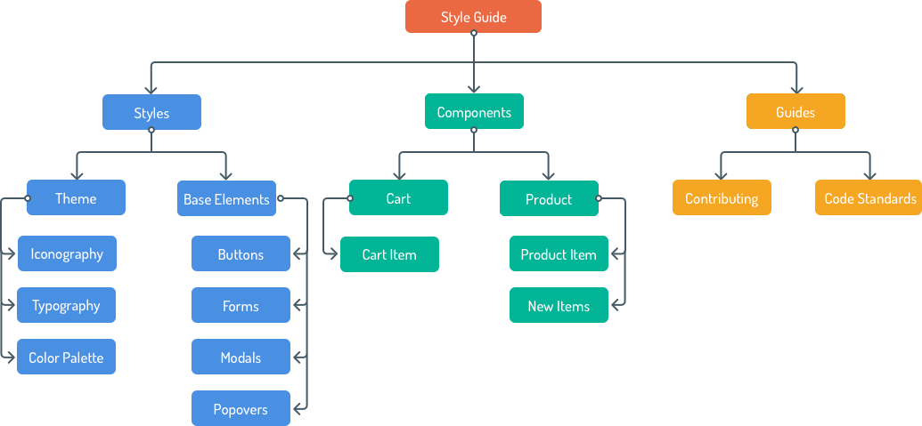
You can see how this diagram takes the shape of a site map, which is basically what you want to use as a plan when creating your living style guide.
Now, dive into the designs and sketch up your own site map, including as many categories as you think would be useful for the future. You can get ideas from other style guides (styleguides.io/examples is a great resource). Once you are done, check this more comprehensive version and compare.
Up Next
With a plan in hand for the living style guide that we want to build, we can now move forward on learning how to get DocumentCSS running and how to create a basic page.
 user experience
Previous Post